Davis
Grown
Summary & Outcomes
- Expanded Davis Grown's digital presence beyond Facebook through a customer-focused website that showcases the farm's story, products, values, and community
- Designed a sustainable ordering solution tailored to the family's operations, avoiding a complex and costly e‑commerce system
- Delivered a maintainable website and client guide to support long-term ownership and future updates
Project Details
- Client: Davis Grown
- Timeline: 9 weeks
- Team: 3 Designers
Focus
- Product Strategy
- User Research
- UI/UX Design
- Stakeholder Collaboration
Tools
- Wix, Canva, Zoom
The Challenge
Founded as Davis Beef in 1980, Davis Grown had evolved into a broader farm brand offering locally raised meats, produce, and baked goods. However, its digital presence hadn't evolved with it. The business primarily relied on Facebook to communicate and fulfill orders, lacking a dedicated website that reflected its values, products, and long-term vision.
Understanding Davis Grown
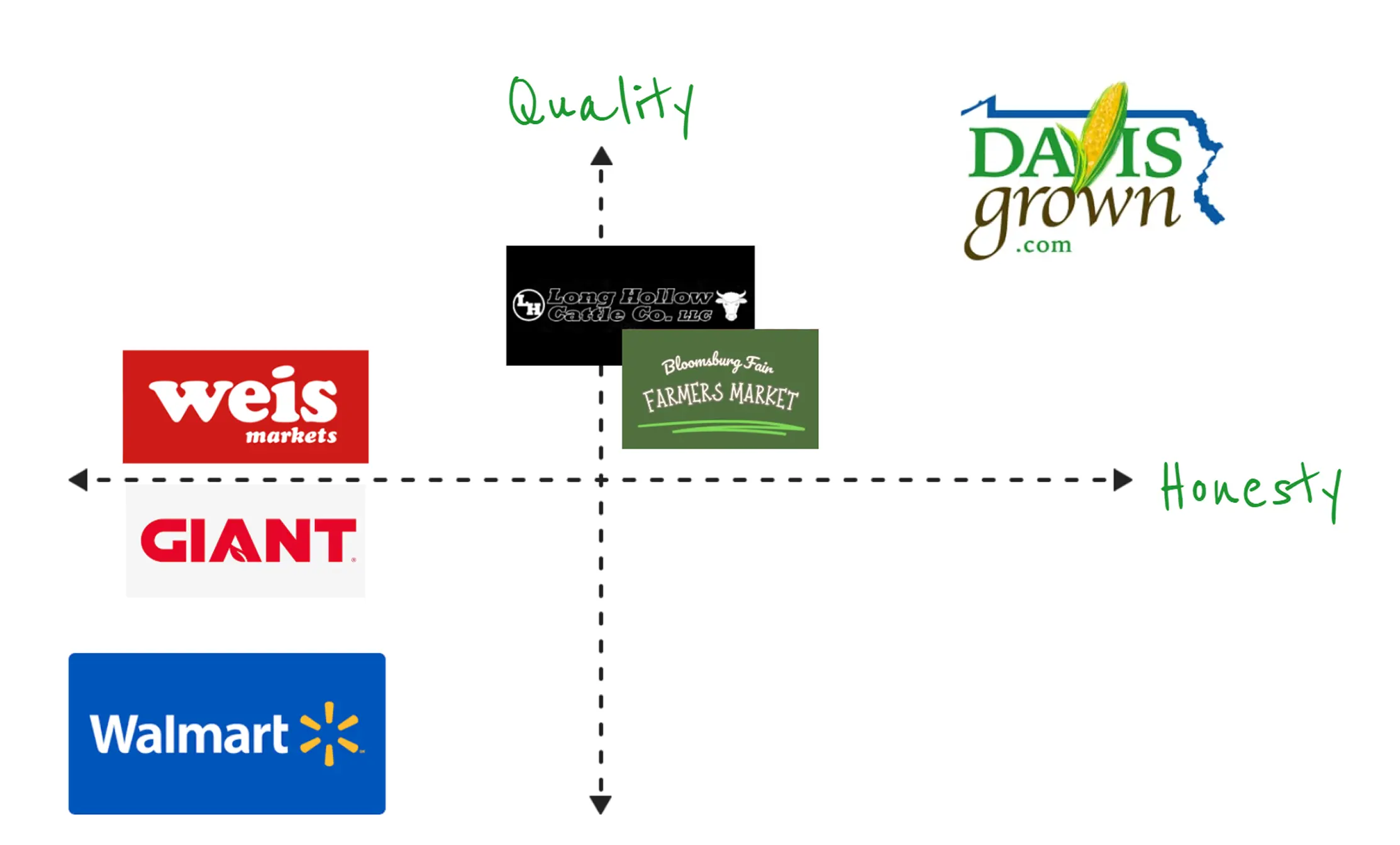
Before exploring design solutions, our team worked closely with the client to develop a marketing strategy analysis. Across five client meetings, we identified what made the farm unique and how a website could best support its growth.
Davis Grown operates in a competitive Central Pennsylvania market alongside grocery chains, farmers markets, and other local farms. With only two employees and a rural location, the business differentiates itself through its dedication to Honesty and Quality.
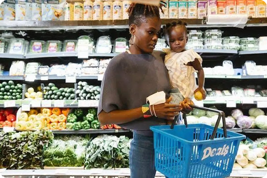
Customers aren't simply purchasing food, they are investing in a family they can trust.
The website needed to communicate authenticity as clearly as it communicated products.
Designing for Three Customer Motivations
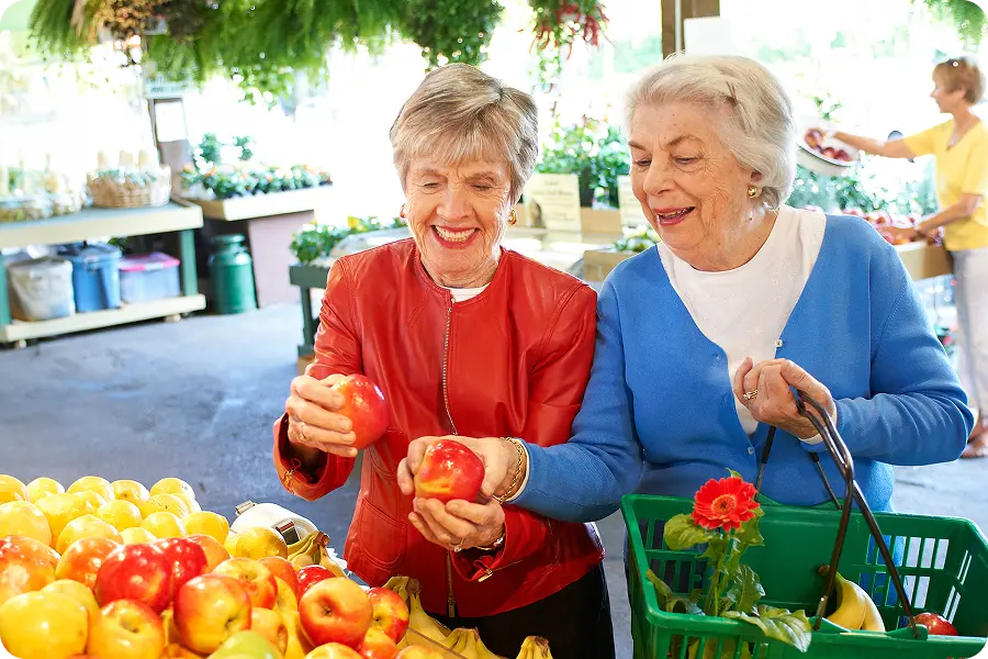
Responsible Family Shopper
Need: Trust in
ingredients
Response: Highlight family story + honesty
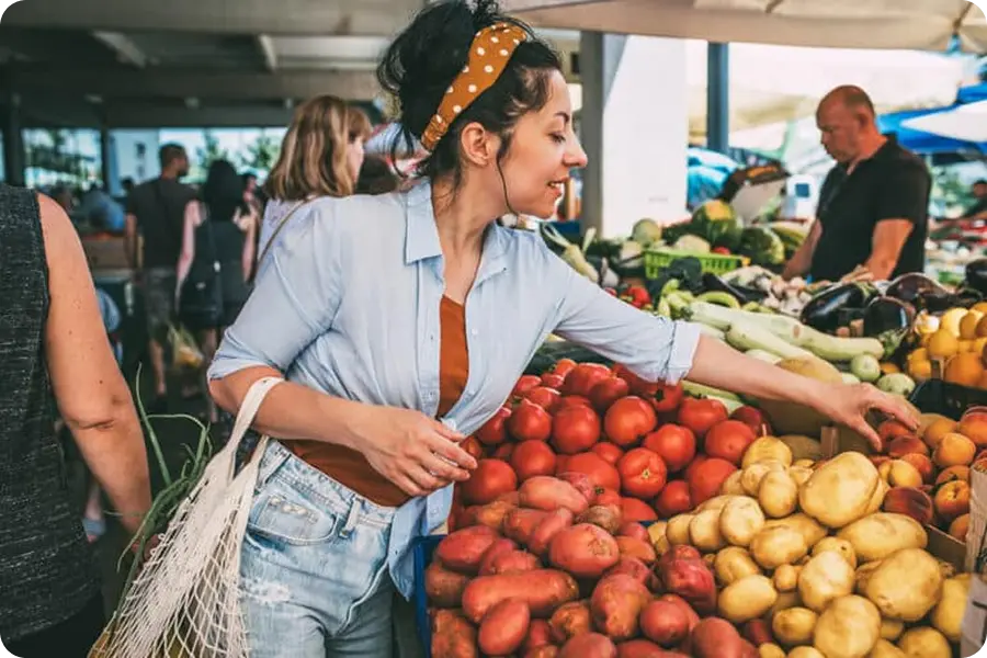
Community-Oriented Shopper
Need: Give back to community
Response: Feature markets + testimonials
Ethical Health Shopper
Need: Humane practices
Response: Explain farming + animal care
Top Design Goals
Visual Exploration
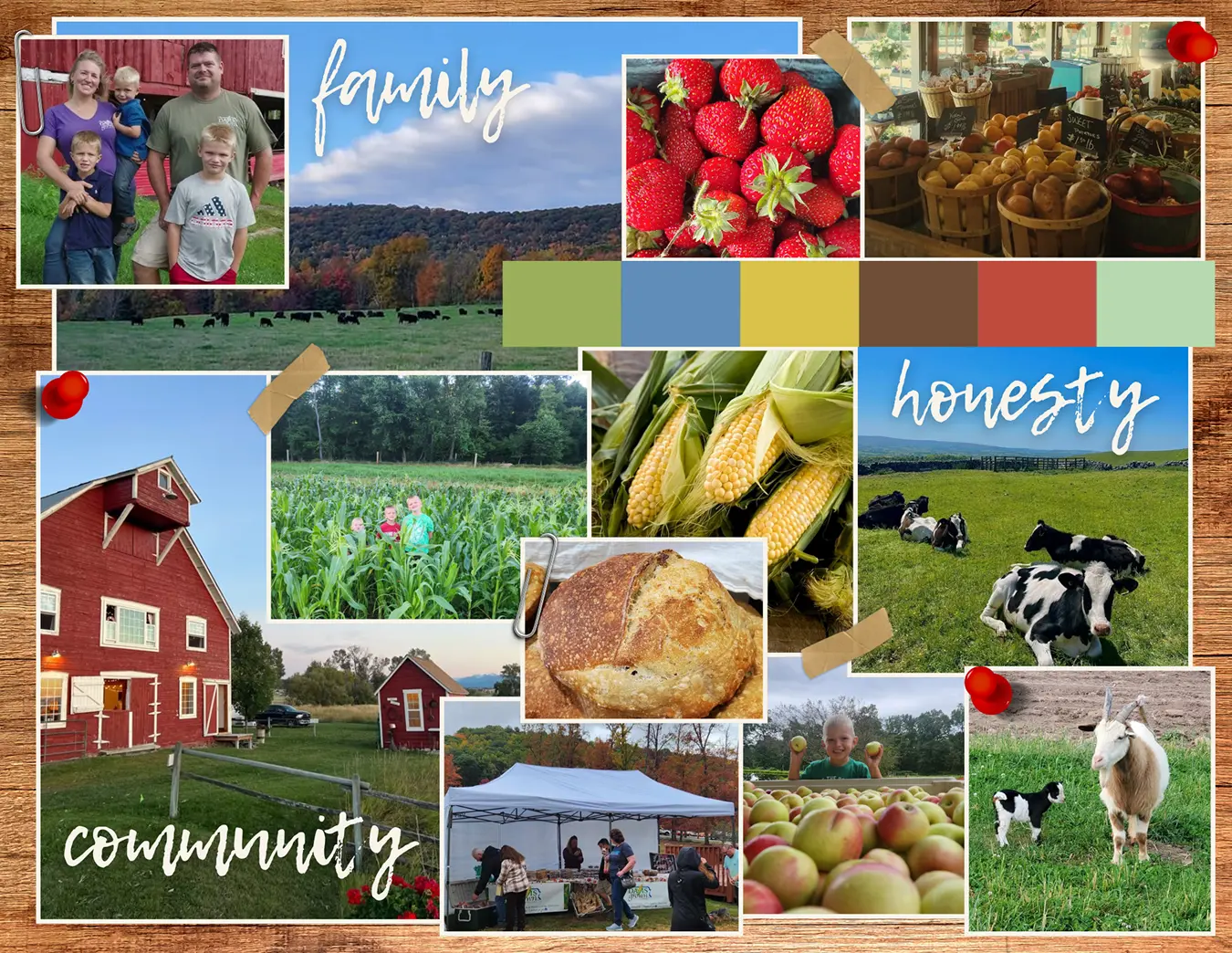
With our goals in place, each team member independently curated an inspiration board to guide our website. We then combined the strongest ideas into a shared design direction through team critique and client feedback.
My Board
Converged Board
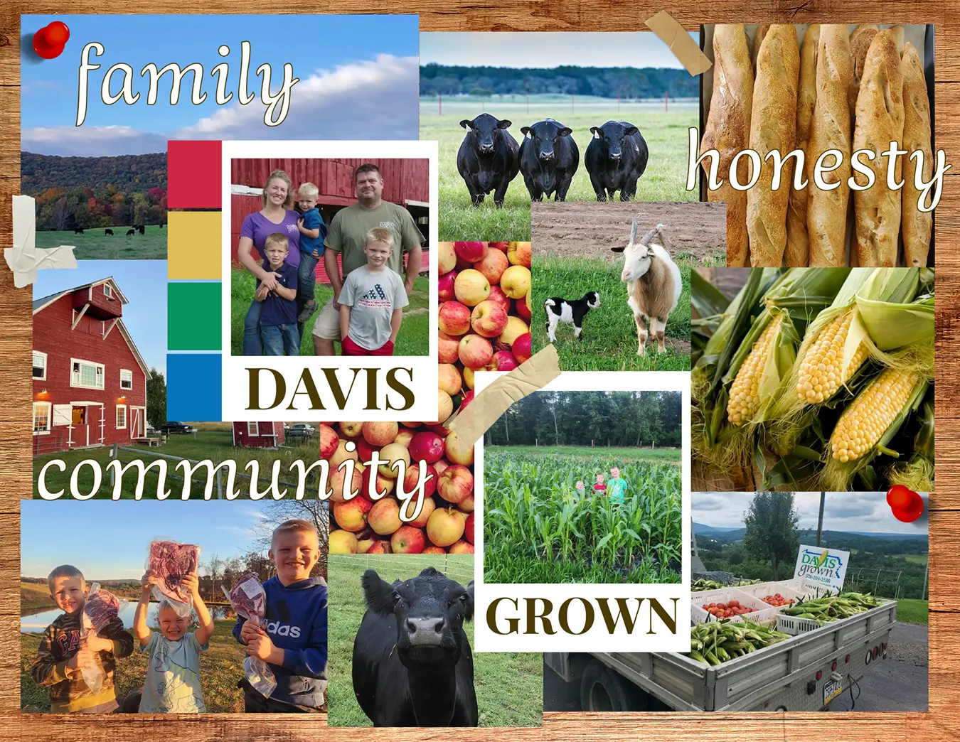
My initial exploration set the themes of family, honesty, and community, which carried into the final design. We simplified the color palette using farm-inspired accents, refined the typography to be more accessible, and added handcrafted details like Polaroid frames and tape for a warmer, homier feel.
Structuring the Experience
I explored three homepage concepts through wireframe sketches, experimenting with different ways to structure the farm's story, products, and calls to action (CTAs).
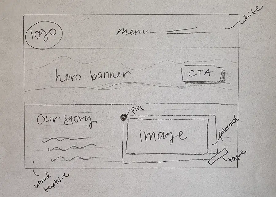
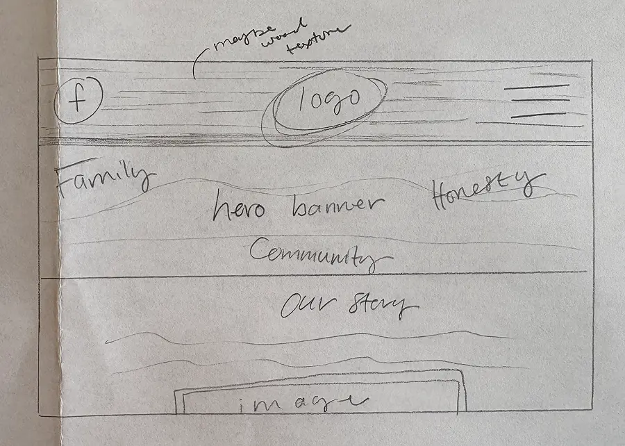
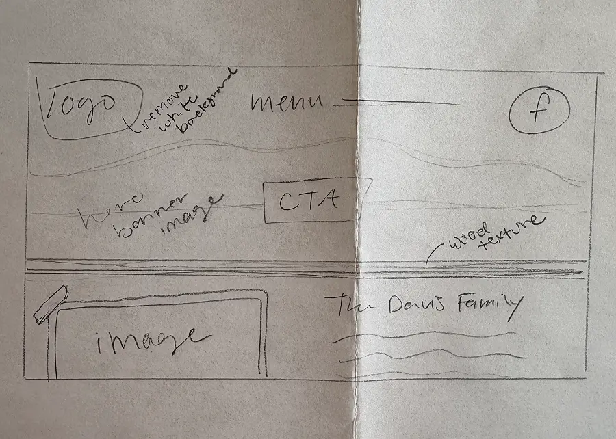
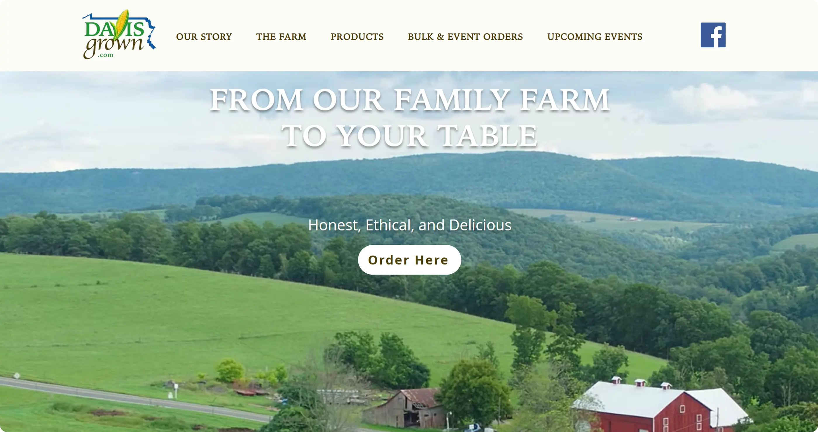
I incorporated Facebook directly into the header to create an immediate connection to Davis Grown's existing online presence. I thought using the key words from our inspiration board accompanied by a nice image of their farm could work well in the hero section. Rather than hiding navigation behind a hamburger menu, I liked the full menu to make the farm's offerings immediately visible. I placed the farm's story directly below the hero to establish trust early.
From Sketches to Screens
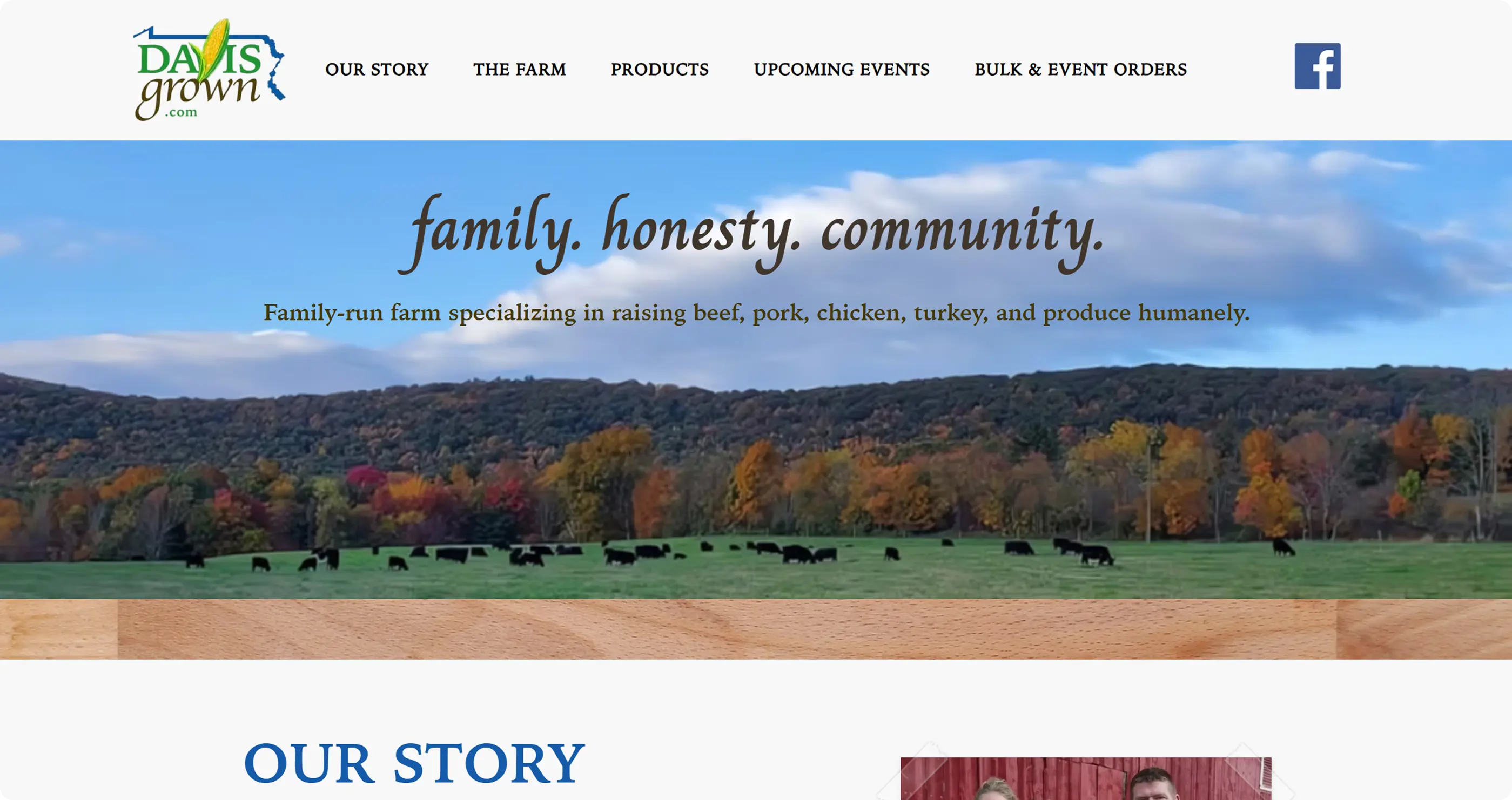
After presenting our individual concepts, we combined the strongest ideas into a single direction, including a clear CTA for ordering and family-centered hero statement. Through multiple rounds of iteration informed by client meetings, critiques, Small Business Development Center feedback, and Google Form responses, we refined both the user experience and visual design before delivering the final Wix-built website.
My Site
A Homey Homepage
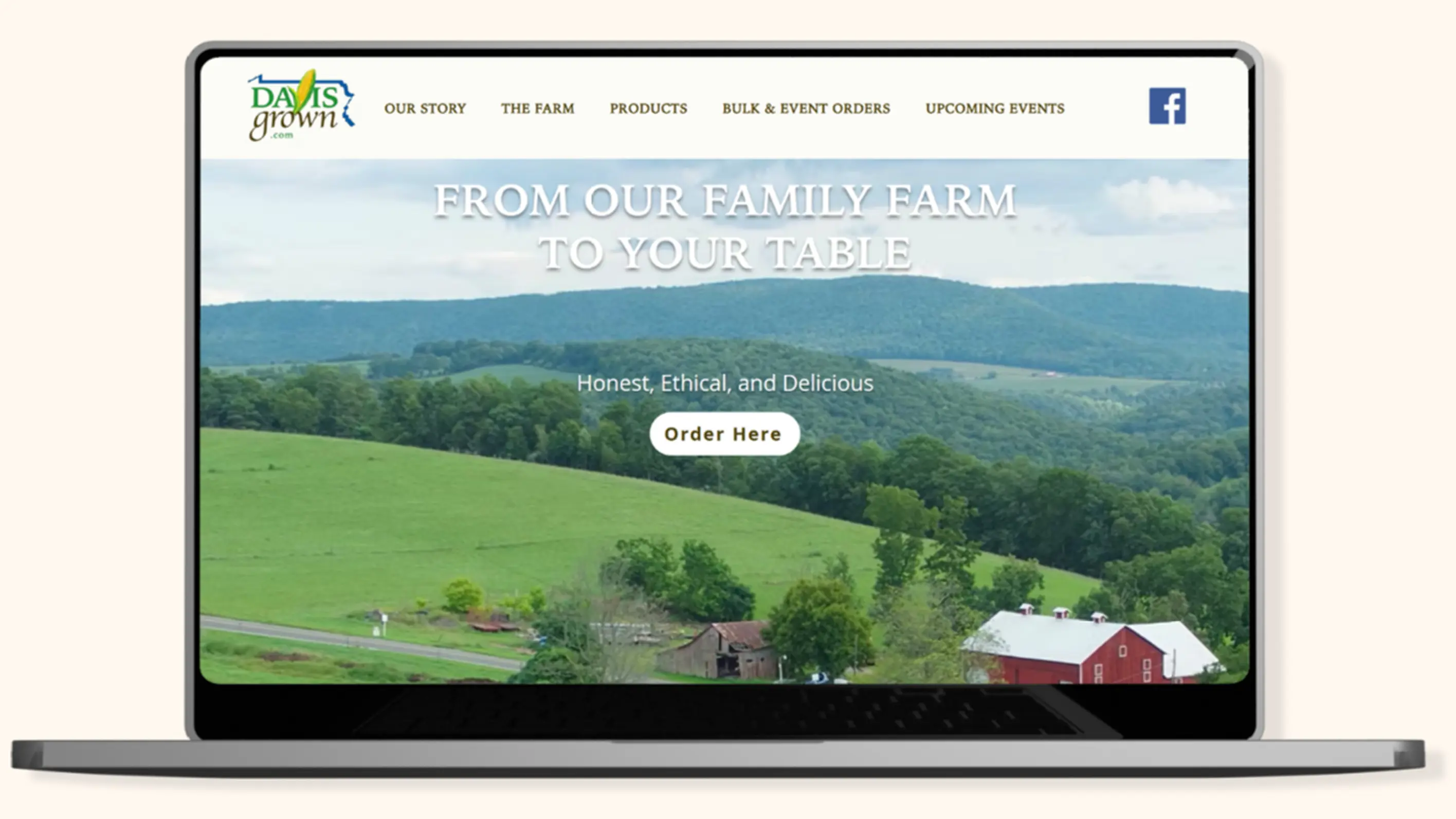
The homepage became the primary storytelling experience, introducing customers to Davis Grown's values while guiding them toward ordering. The hero image of the farm not only creates an emotional connection but also naturally introduces the red barn accent from our visual direction. Rather than relying only on UI colors, we pulled inspiration from the farm itself through photography, creating a more authentic connection to the brand. The persistent header improves accessibility while reinforcing key actions across the site, including product discovery and Facebook engagement. To strengthen brand cohesion, we prominently displayed their logo and carried its all-caps serif style into the menu and hero statement.
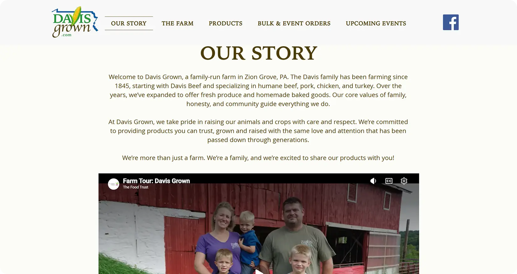
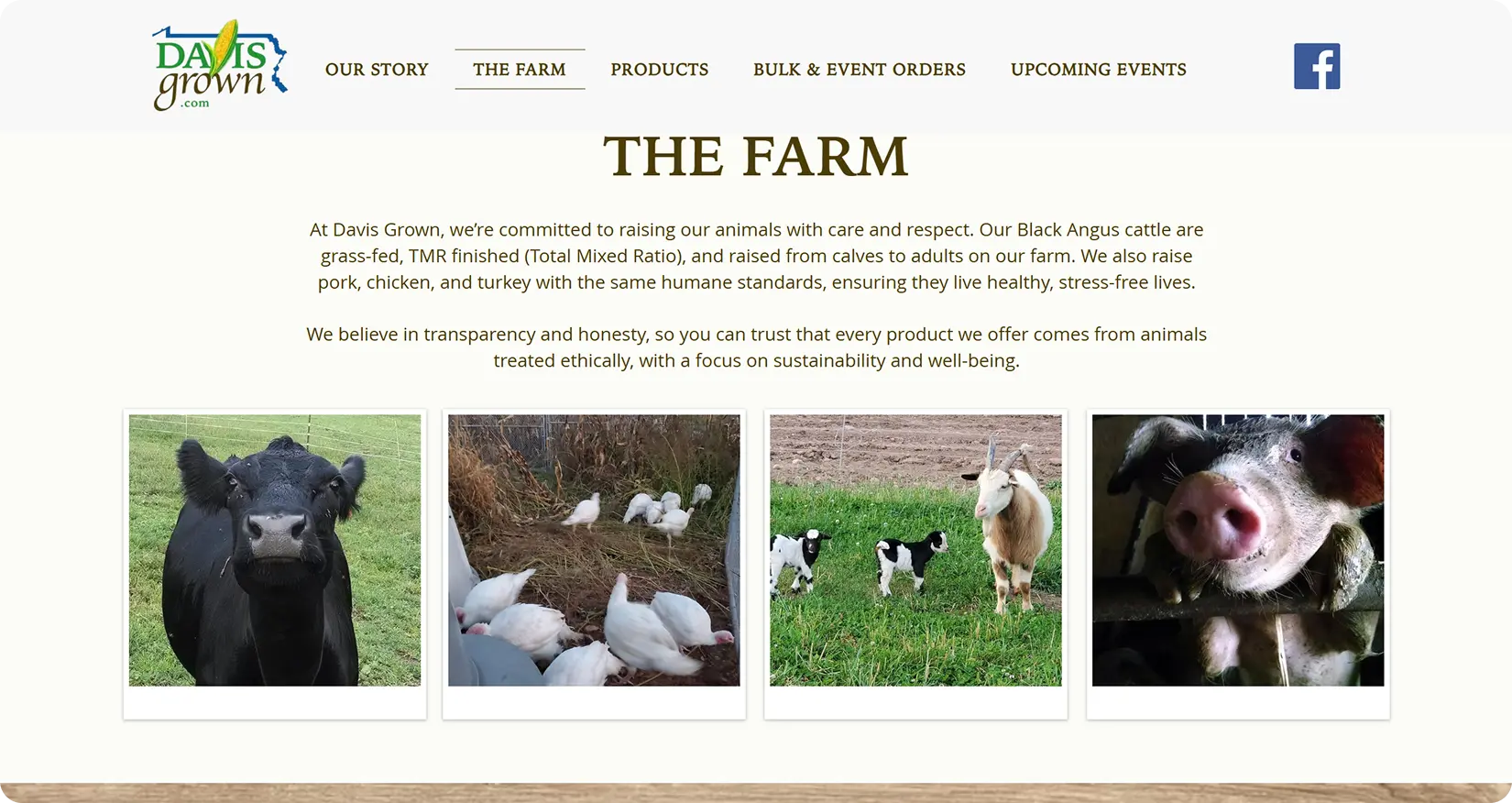
Instead of separating "Our Story" and "The Farm" into individual pages, we anchored both sections within the homepage to create a seamless storytelling experience. This reduced unnecessary navigation while helping users quickly understand the family's values and farming practices, key drivers of trust identified during our research.
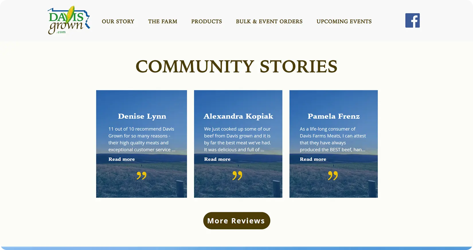
To again highlight that existing trust and digital presence, "Community Stories" features customer testimonials, with "More Reviews" leading to their Facebook page ratings.
The E-commerce Tradeoff
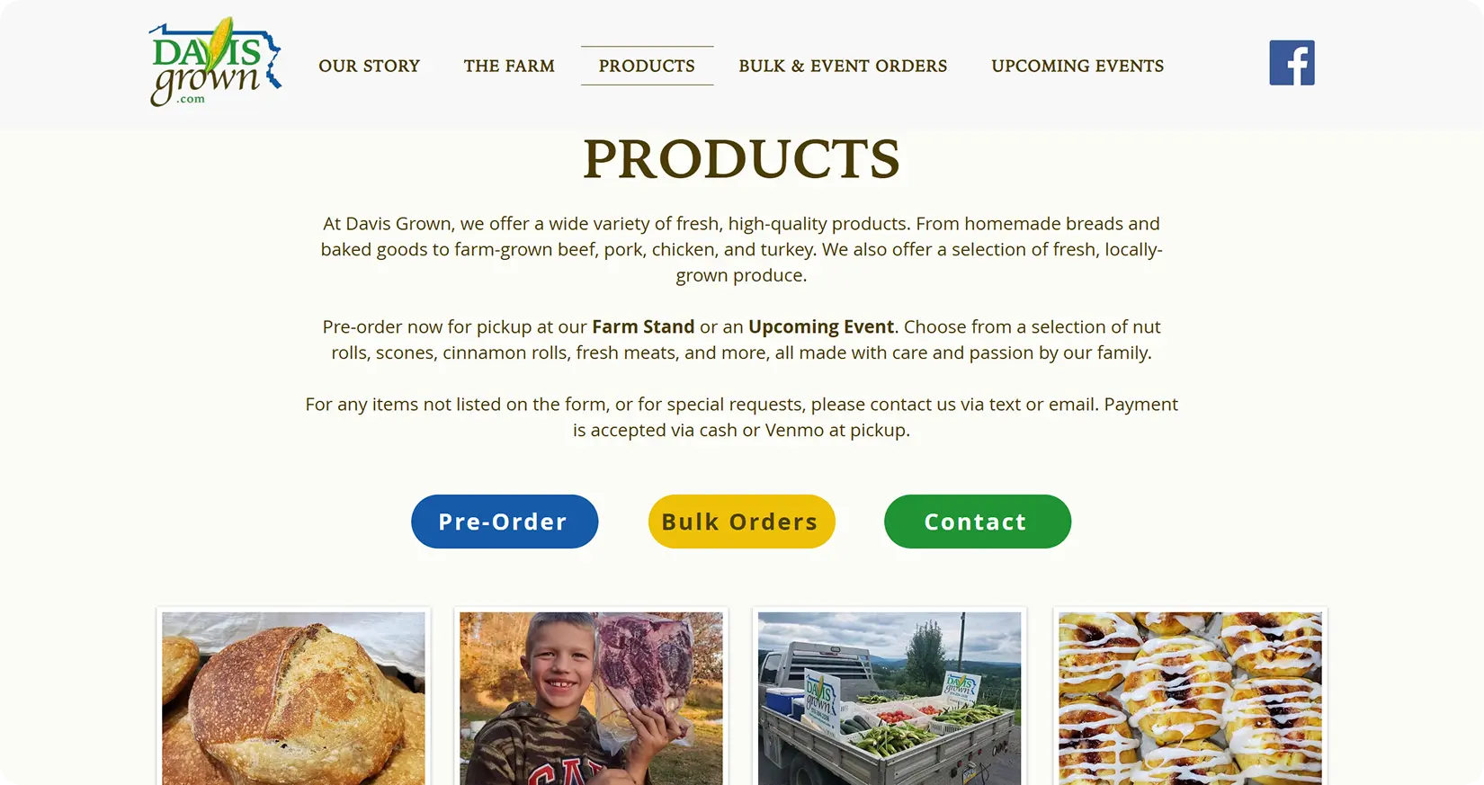
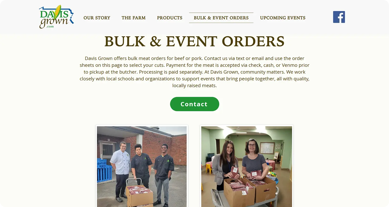
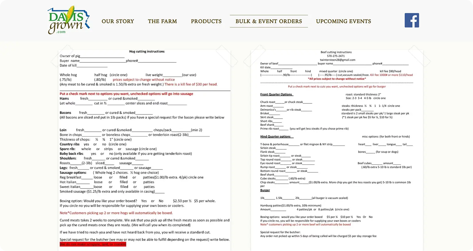
Rather than implementing a traditional e-commerce store, we designed an ordering experience aligned with Davis Grown's operational needs. A Wix e-commerce plan would have required a premium subscription and ongoing inventory management, an unrealistic solution for a two-person family farm. Instead, we collaborated with the client to create a simpler system using Google Forms for pre-orders, downloadable cut sheets for bulk orders, and direct email or text for custom requests. This approach minimized maintenance while keeping ordering intuitive for customers.
To improve clarity, each CTA uses a distinct accent color inspired by our visual direction. Green consistently represents contact, while blue and yellow distinguish pre-orders from bulk orders, creating a clear visual hierarchy. Following feedback from the Small Business Development Center, we reserved red for the farm's natural imagery, such as the barn and fresh produce, allowing the photography to reinforce the brand without competing with primary actions.
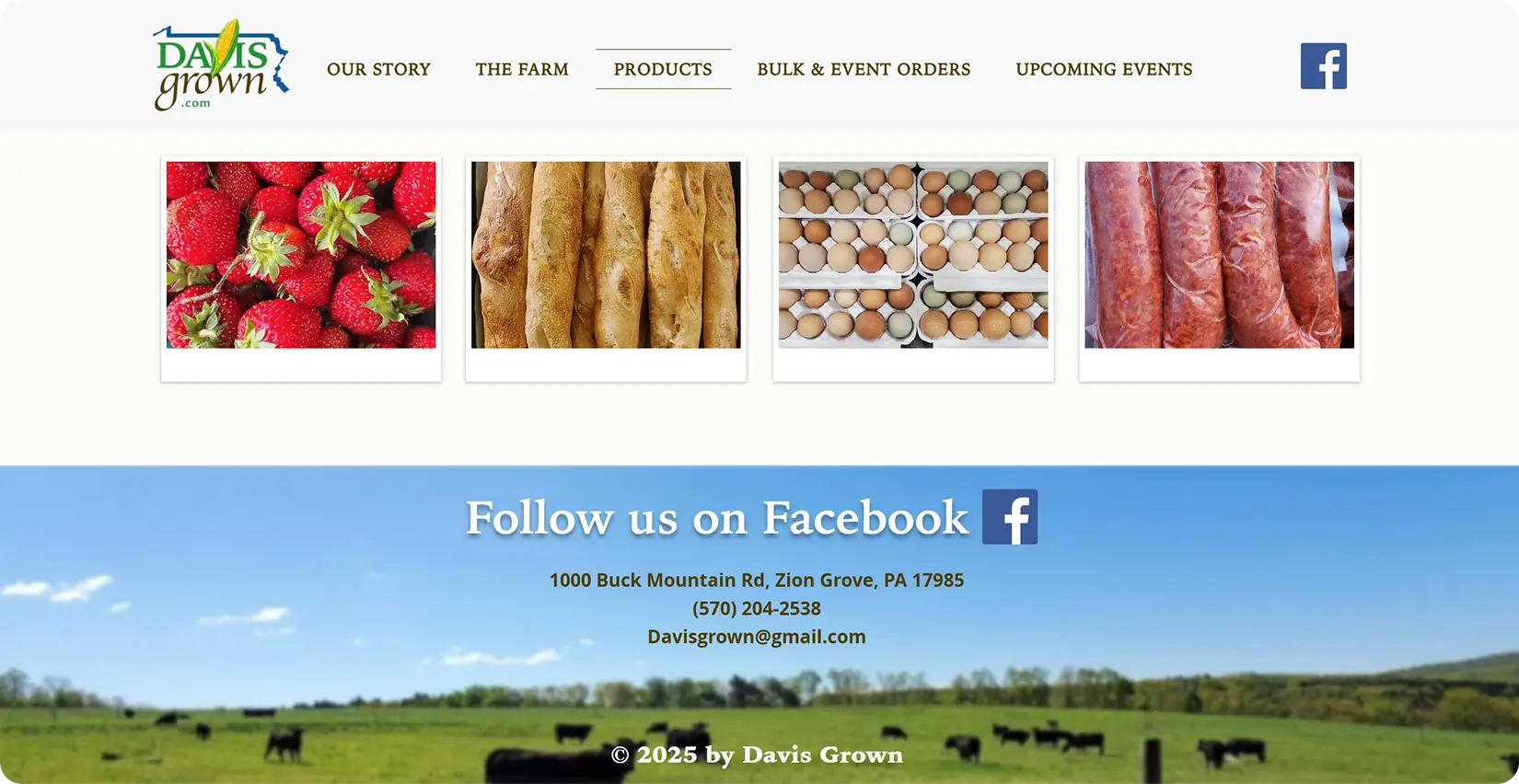
Repeating Facebook in the footer strengthens the connection between Davis Grown's new website and trusted social media presence.
Supporting Local Connections
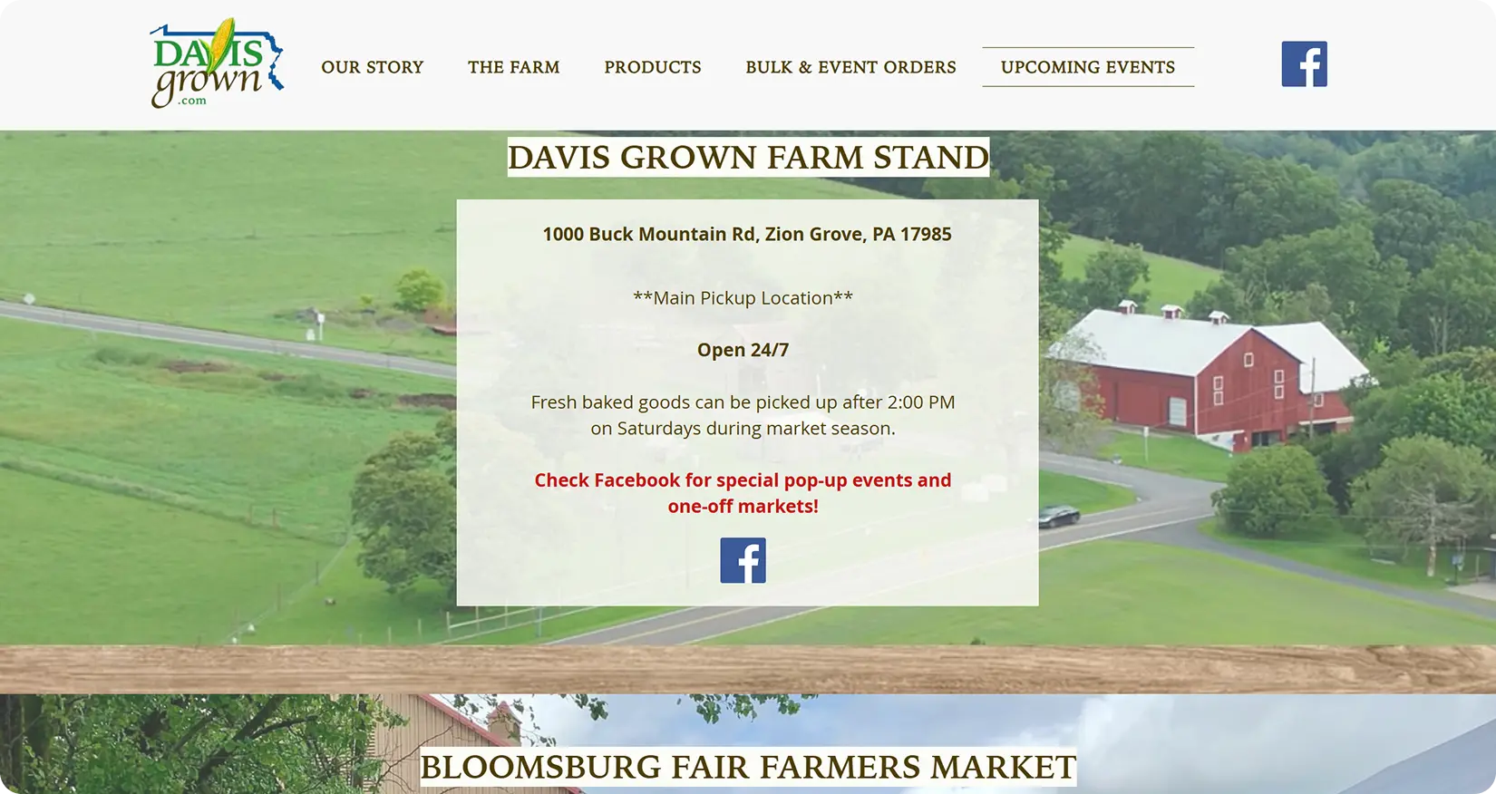
A dedicated "Upcoming Events" page helps customers find Davis Grown throughout the season. The farm stand remains the permanent pickup location with a direct Google Maps link, while a reusable event template allows the family to easily update future markets.
The Hand Off
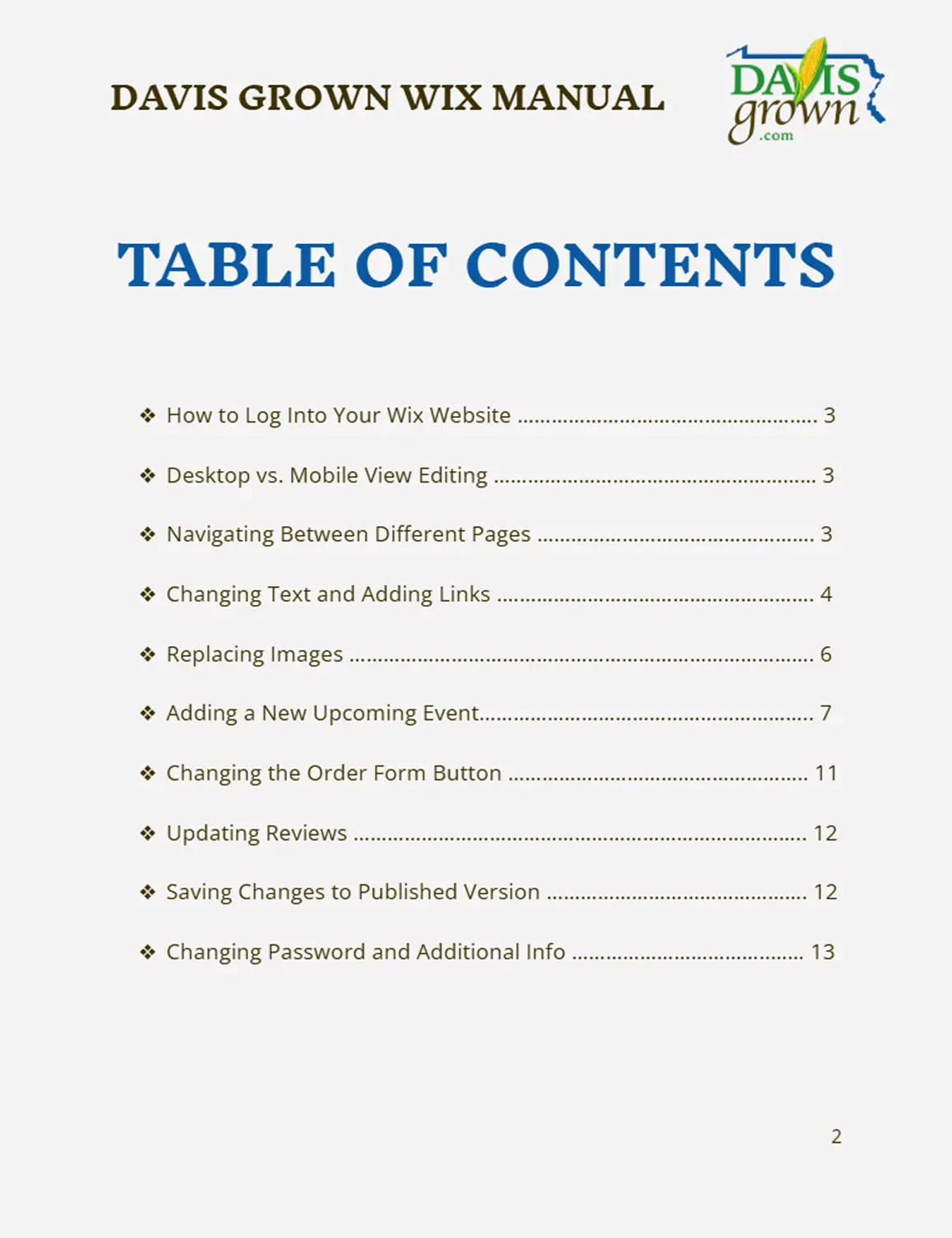
To support long-term ownership, we delivered a detailed Client Manual documenting everything from logging into Wix to adding new events and updating reviews. This allowed Davis Grown to confidently manage and evolve the site after project completion.
Note: The 9-week timeline focused on developing the marketing strategy and desktop website experience. While mobile design was outside the project scope, we included guidance for editing Wix's desktop and mobile views to help maintain uniformity across devices.

Reflection
This project reinforced that effective design begins with understanding. By analyzing Davis Grown's market, customers, and business goals before exploring ideas, we created a foundation that guided every design decision. I learned that the strongest solutions are not always the most complex, but the ones that balance user needs with business realities, creating an experience that is valuable for customers and sustainable for the client.