Home At
Last
Summary & Outcomes
- Improved Home at Last Dog Rescue's website experience with clearer navigation, calls to action (CTAs), and a more organized content structure
- Refined wireframes and user flows through usability testing and iterative feedback
- Designed a cohesive, accessible visual system and responsive prototypes across desktop, tablet, and mobile
Project Details
- Dog Rescue: Home At Last
- Timeline: 5 weeks
- Team: Individual Project
Focus
- Usability Testing
- Information Architecture
- Responsive UX/UI Design
- Prototyping
Tools
- Figma
Identifying the Opportunity
Home at Last Dog Rescue's mission depends on visitor support, whether adopting, volunteering, or donating. I saw an opportunity to improve the website experience by reducing friction and helping users quickly find the path that matched their goals.
Defining Primary User Goals
After analyzing the existing experience, I identified the three primary actions visitors come to the website to accomplish.
Usability Testing
I conducted usability testing with five first-time users to understand how visitors navigated the existing website and where they encountered pain points.
Key Findings
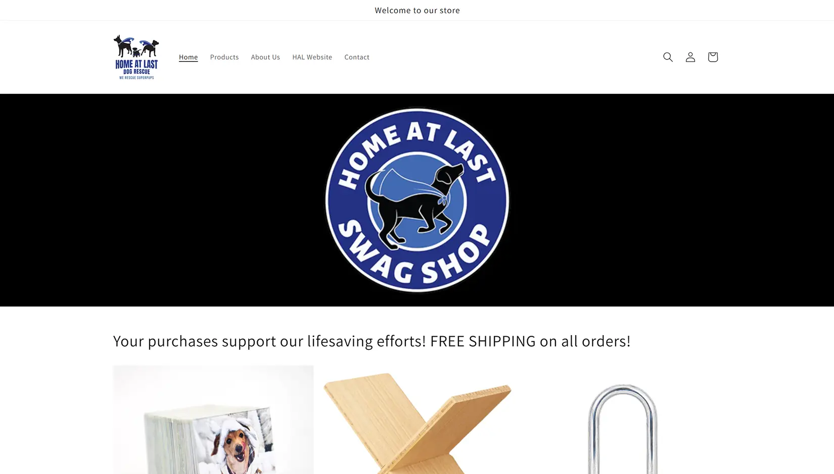
“Shop” button created confusion
- Users expected to browse adoptable dogs, but the button redirected them to an external “Swag Shop” site
Navigation buried visitors' primary goals
- Participants recommended surfacing adoption, volunteering, and donation pathways earlier in the experience
Mission was immediately understood
- Users quickly recognized the organization as a dog rescue, especially appreciating the “Dog of the Week” feature
The homepage lacked hierarchy
- Participants wanted more homepage information to reduce reliance on the crowded navigation
Visual consistency could be improved
- Users felt flyer graphics and inconsistent visual elements made the site feel outdated at times
Early Exploration
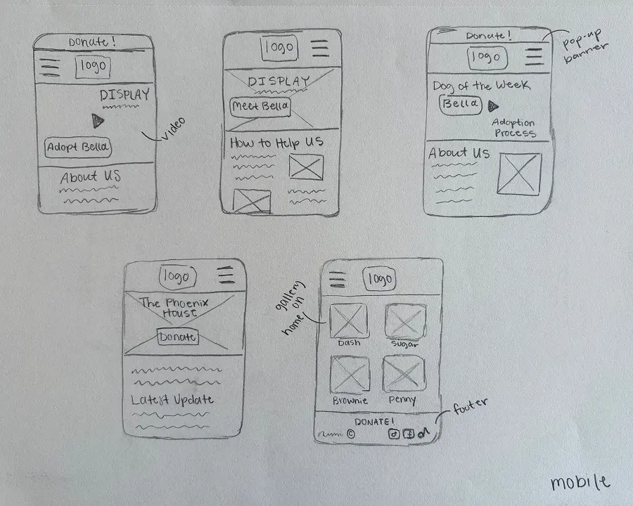
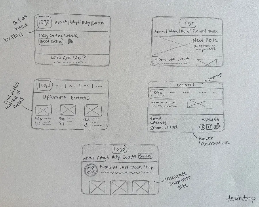
I sketched multiple homepage layouts across desktop and mobile to determine the strongest content hierarchy and navigation structure before diving into Figma.
Initial Wireframes
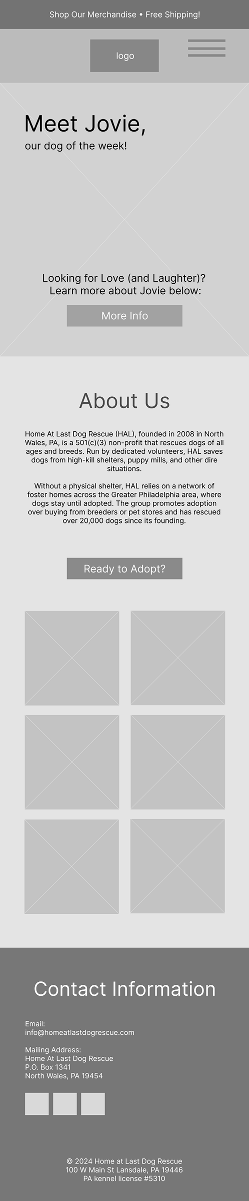
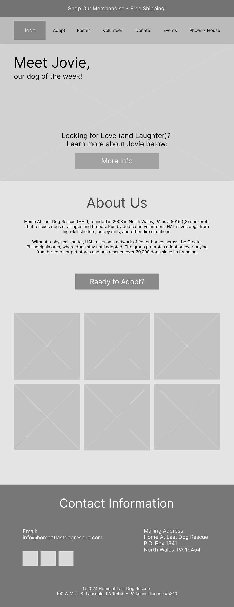
Based on usability testing insights, I designed a homepage that prioritized adoption while maintaining the emotional connection users had with the original website. I retained the “Dog of the Week” feature and expanded the homepage to better introduce the organization. Dispersing some content here allowed me to better structure navigation around visitors’ primary goals.
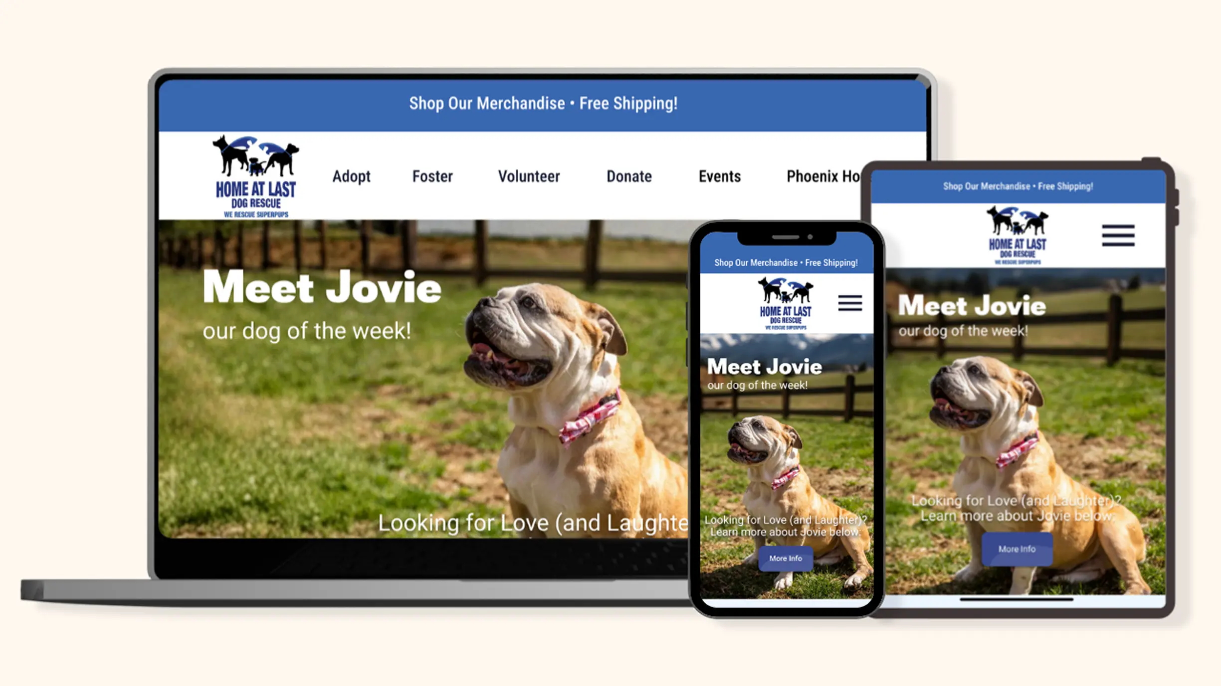
Merchandise was separated into a dedicated banner to avoid confusion with adoption, while responsive layouts adapted the navigation across mobile, tablet, and desktop, such as a full menu compressing to a hamburger.
Mobile

Tablet
Desktop
Refining the Experience
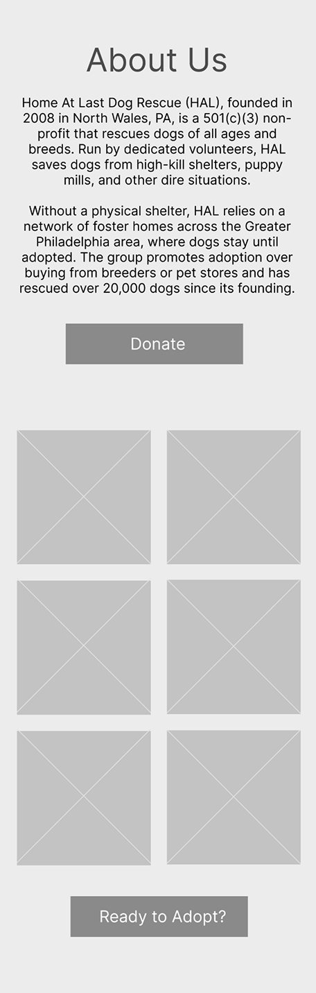
Feedback from three reviewers revealed that the “Ready to Adopt?” button felt disconnected from the dog gallery and recommended creating a clearer path from browsing to adoption. They also suggested introducing a dedicated donation CTA.
Based on this feedback, I repositioned “Ready to Adopt?” beneath the dog gallery to create a more intuitive adoption journey. I also added a “Donate” button to activate the “About” section.
Building the Visual System
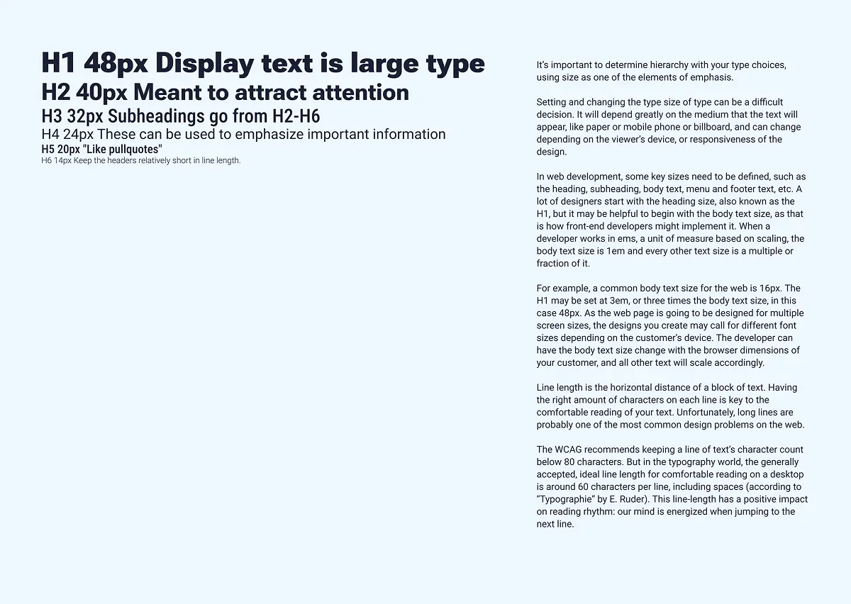
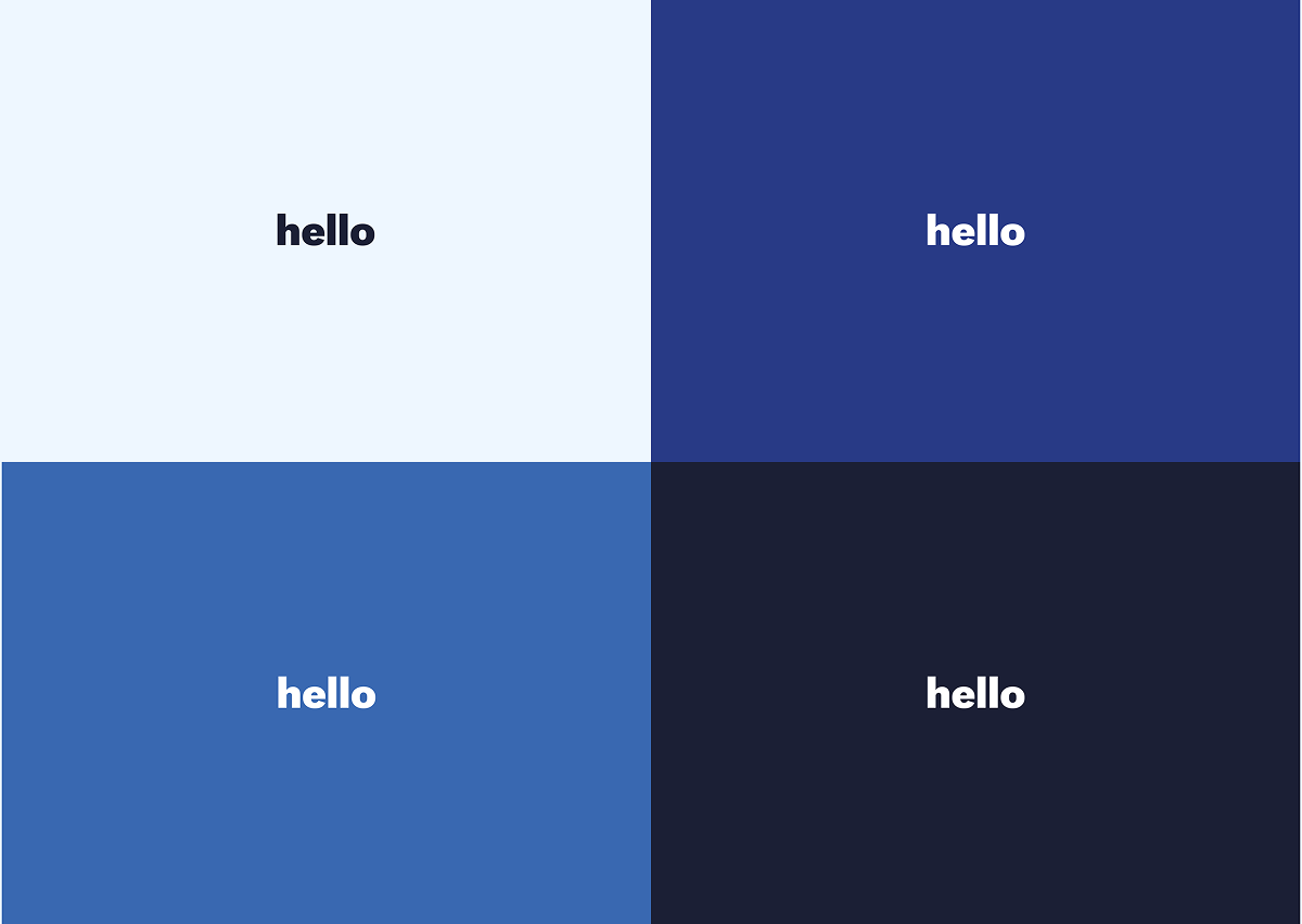
I translated Home at Last’s existing branding into a cohesive visual system by refining its color palette, typography, and interface elements for a more modern, accessible experience.
Style Guide
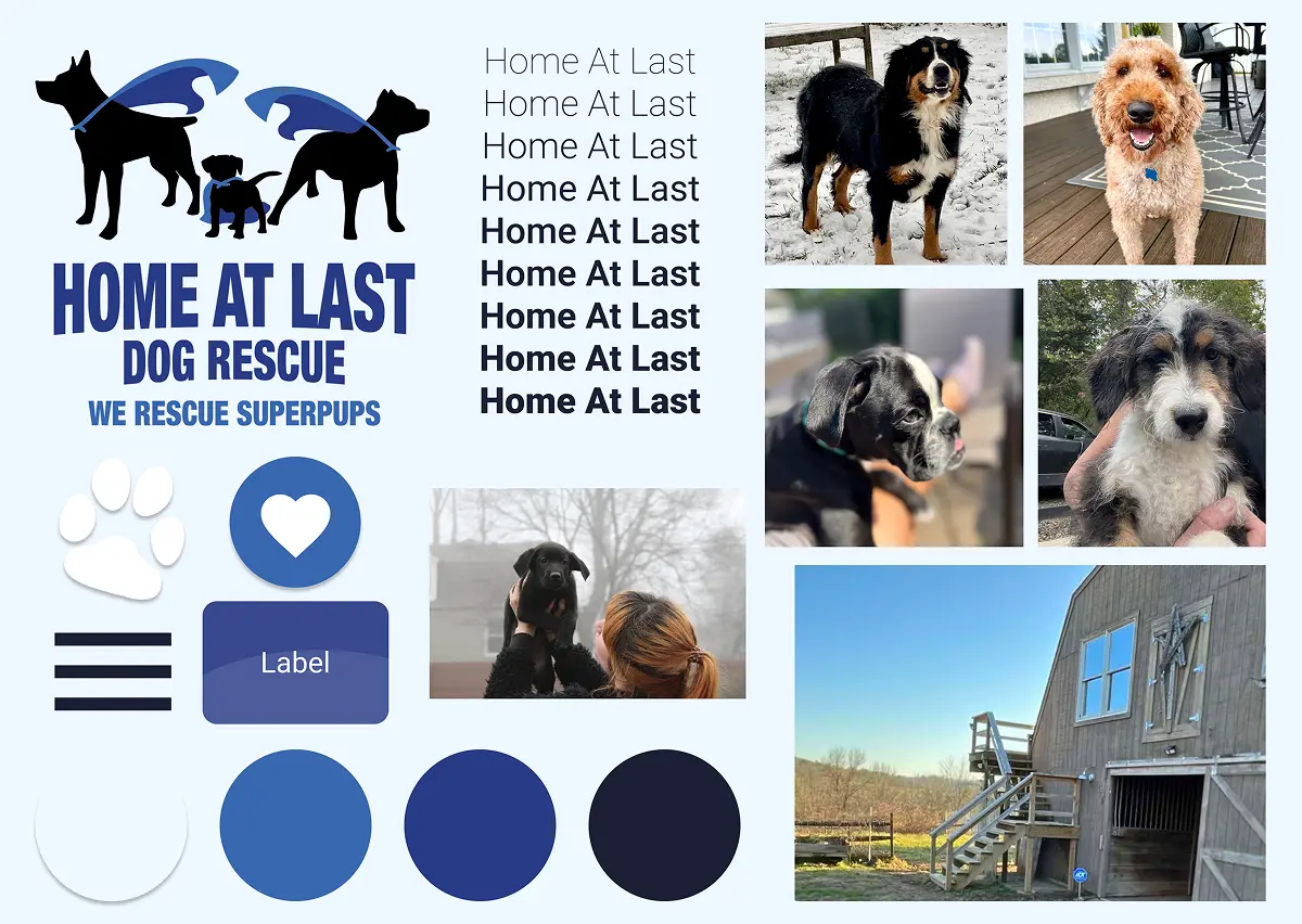
Typography
AAA Color Contrast
HOME At Last
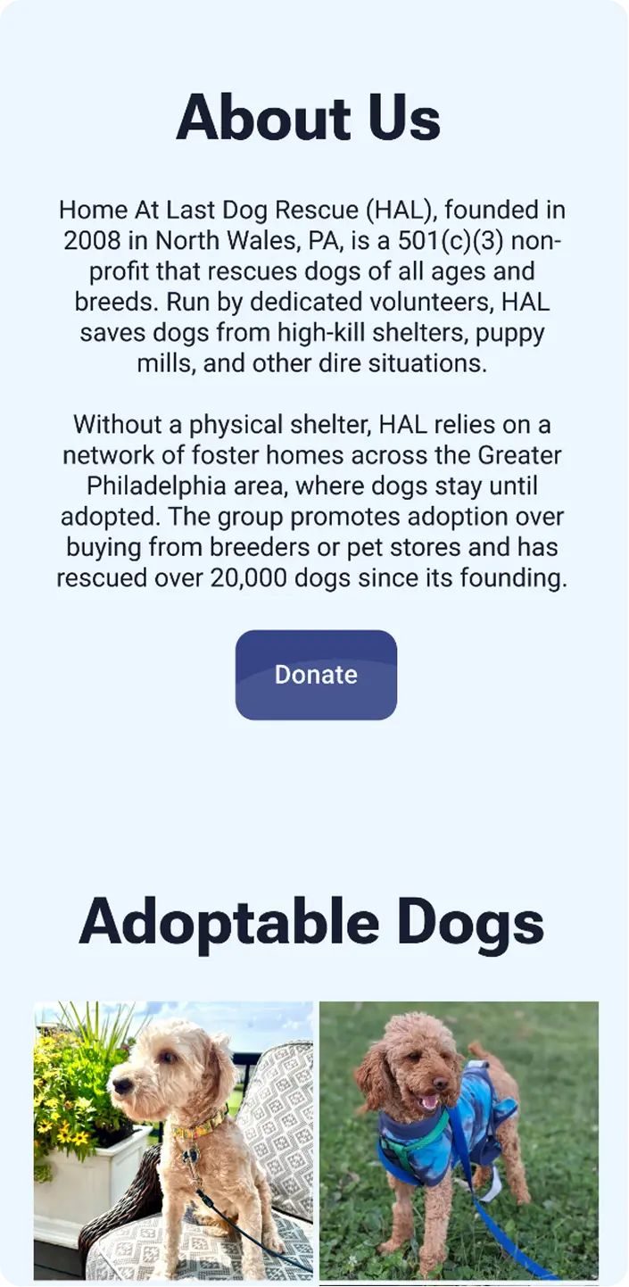
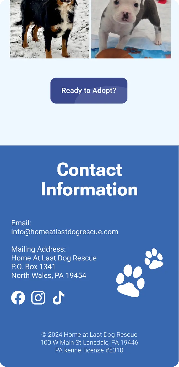
I applied the visual system across the homepage, using the “Dog of the Week” feature as an emotional entry point that encourages visitors to meet dogs looking for an owner.
By expanding the homepage with an “About” section, I streamlined the navigation and surfaced important actions like Adopt, Foster, Volunteer, and Donate. I also incorporated playful UI elements from the style guide into the footer while ensuring visitors could easily access contact information.
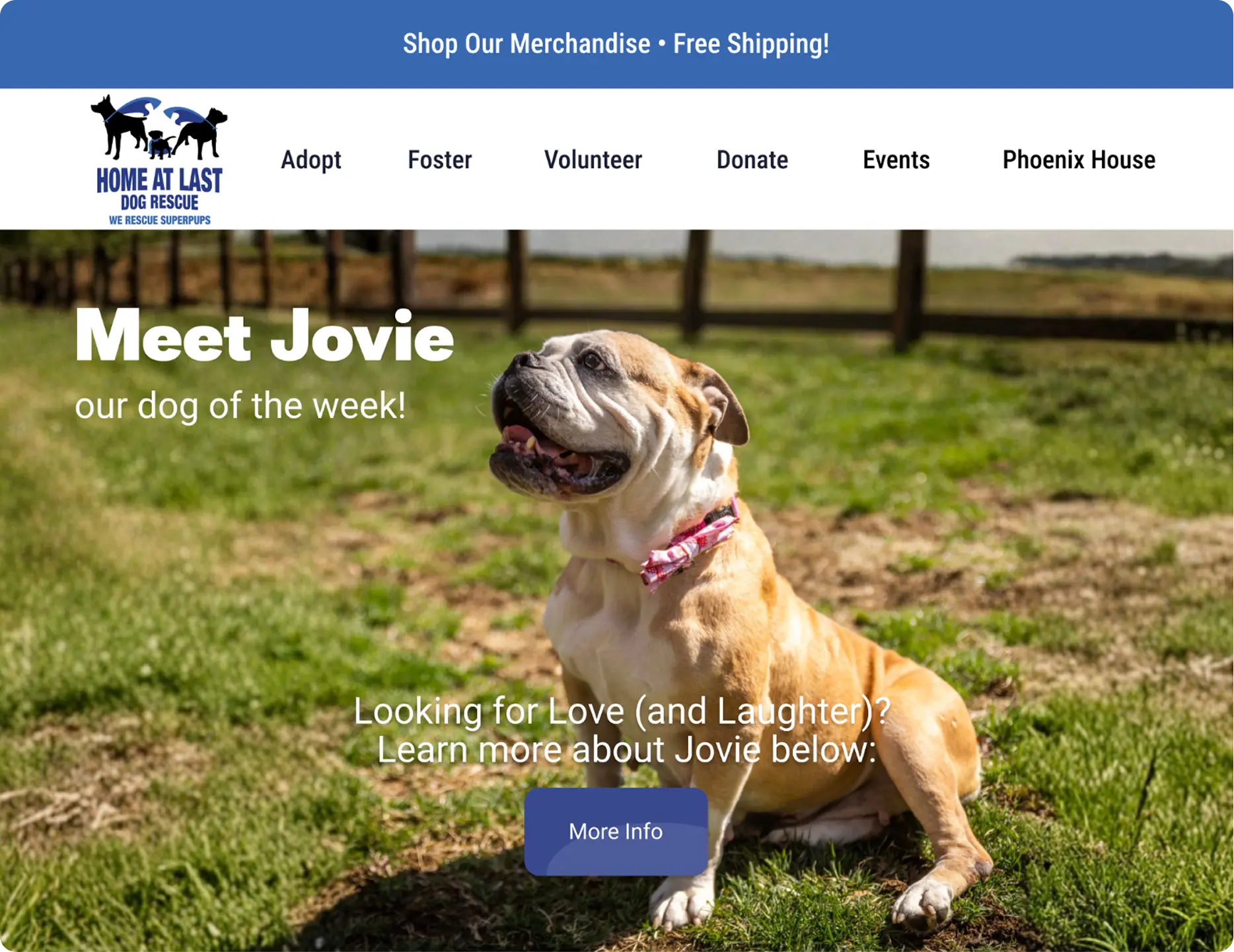
Finding a Forever Home
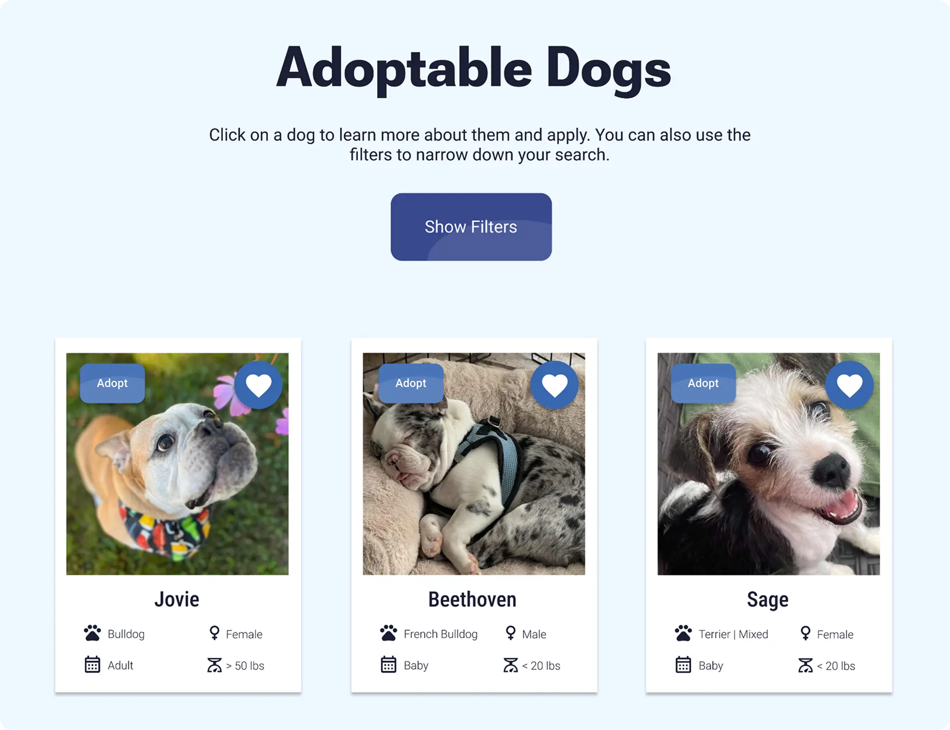
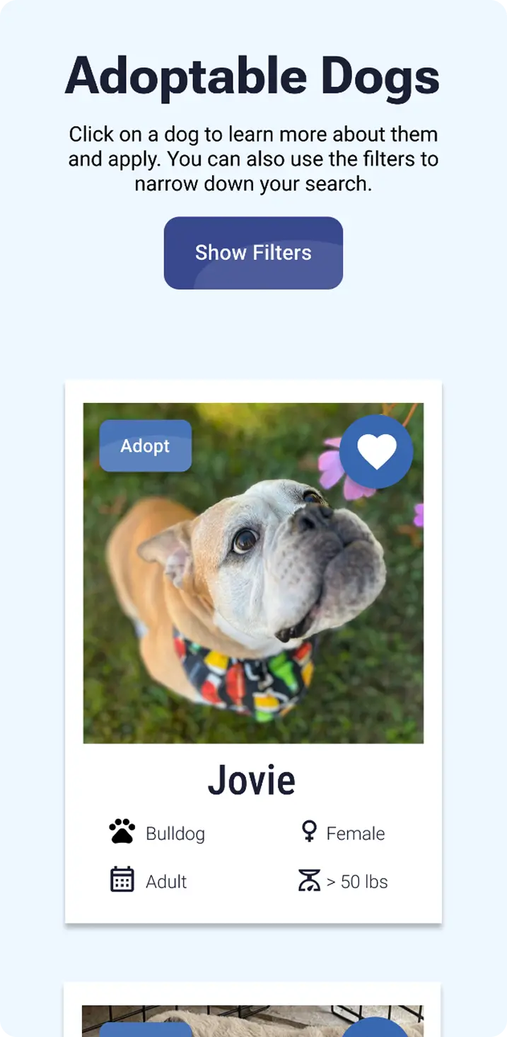
The adoption page was redesigned to create a more approachable browsing journey for visitors looking for their future companion. Rather than displaying every filter upfront, I condensed them into a “Show Filters” button to reduce visual clutter while keeping search functionality accessible.
Each dog card highlights essential adoption details alongside quick actions to favorite a dog through a heart icon or begin the adoption process. A responsive grid adapts naturally across devices.
Filtering Before

V.S. After
Dog Profile Experience: Jovie
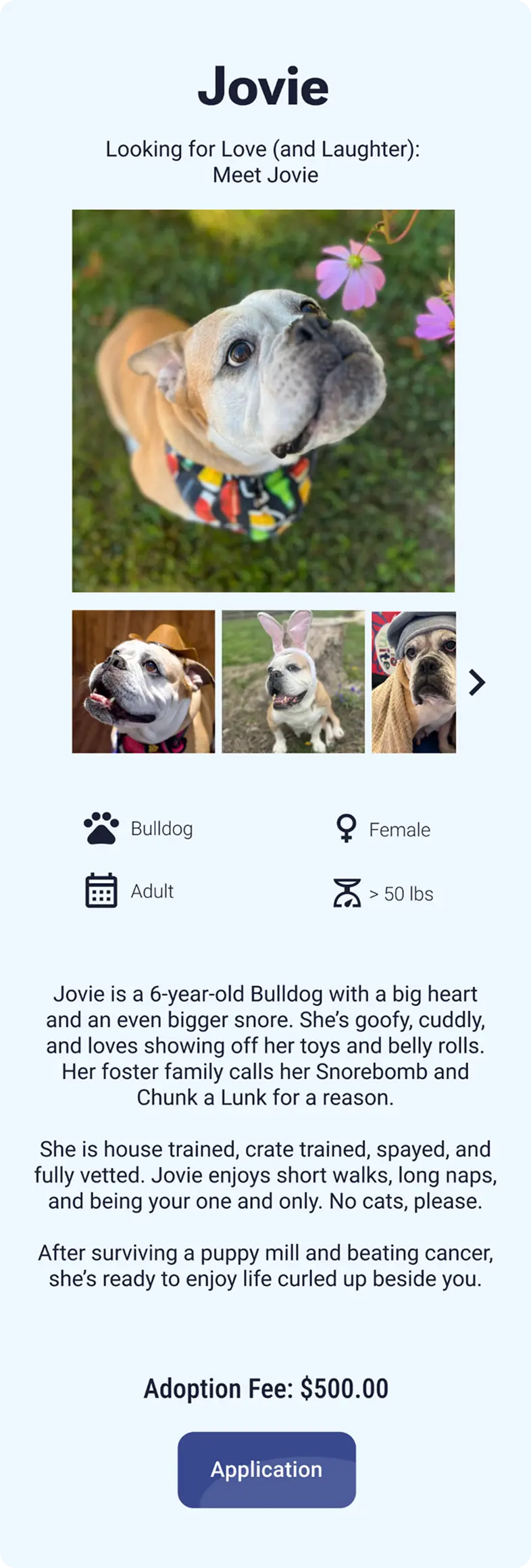
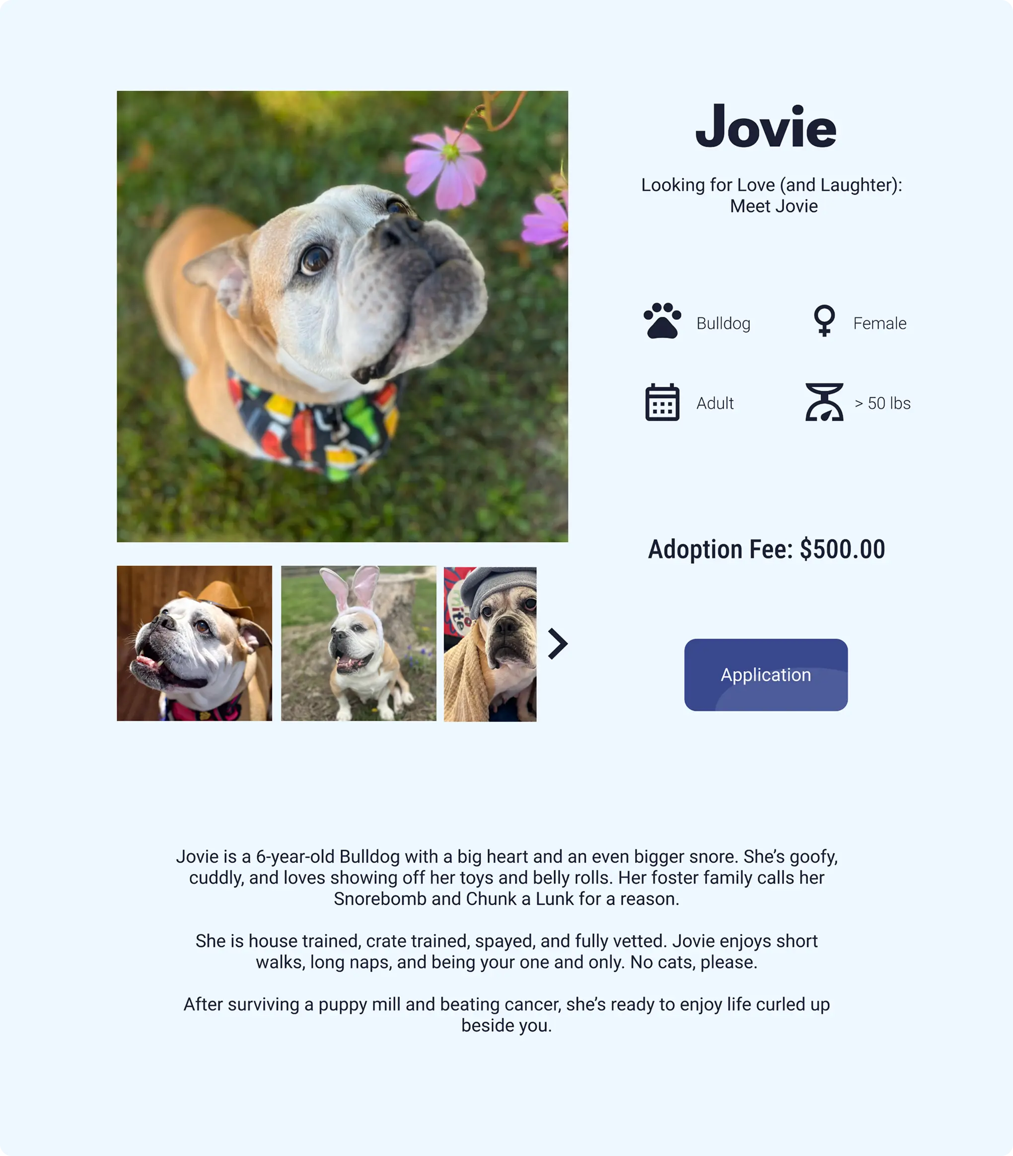
The dog profile page was designed to help visitors connect with each dog before making an adoption decision. A featured image gallery allows users to browse additional photos through intuitive thumbnail navigation. On mobile and tablet, I prioritized a natural scroll experience by stacking content vertically.
On desktop, I used the additional space to create a more immersive, balanced two-column layout that pairs the photo gallery with adoption details.
Mobile/Tablet
Desktop

Reflection
This project strengthened my understanding of how research-driven decisions shape meaningful experiences. By testing the existing website, identifying visitor goals, and iterating on designs, I learned that effective UX comes from prioritizing what matters most to users. For mission-driven organizations like Home At Last, successful design must make it easy for visitors to take action while preserving the emotional connection that inspires people to support.