Schwenksville
Library
Summary & Outcomes
- Redesigned Perkiomen Valley Library's visual identity with a brandmark rooted in Schwenksville's local character
- Built a reusable brand system including logo variations, typography, color, patterns, and custom icons to establish consistency across platforms
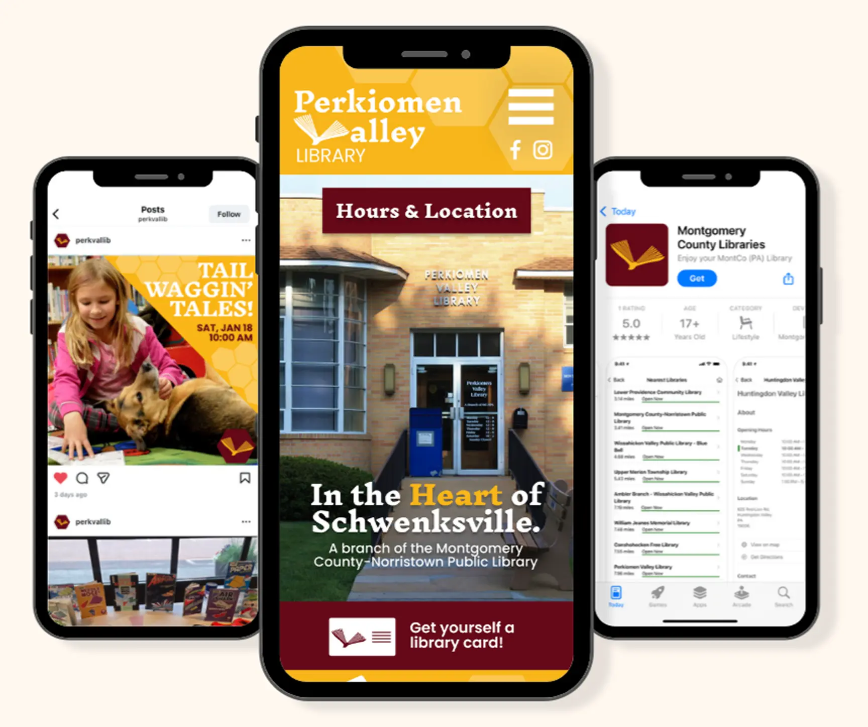
- Applied the identity across 5+ touchpoints, including a mobile interface, app icon, Instagram template, and promotional poster
Project Details
- Library: Perkiomen Valley
- Timeline: 3 weeks
- Team: Individual Project
Focus
- Brand Identity Design
- Graphic Design
- UI Design
- Design Systems
Tools
- Figma, Illustrator, Canva
Starting with a Blank Canvas
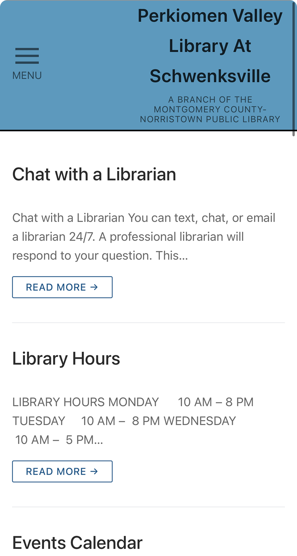
Perkiomen Valley Library's existing digital presence featured little to no established branding. Without a cohesive visual identity, the library's connection to Schwenksville was not reflected online.
Having grown up visiting this library, I saw an opportunity to create an identity that better captured its character and charm.
The existing website presented essential information with minimal visual hierarchy. Generic blue accents, black-and-white typography, and the absence of imagery stripped the library of its personality.
Designing within a Larger System
Perkiomen Valley Library operates within the Montgomery County Pennsylvania Library District, where individual branches share a common visual language through burgundy and yellow hexagonal marks which represent honeycombs and reflect the community's busy, connected nature.
Each branch incorporates a unique icon tied to its local identity within the hexagon, creating uniformity across the system while allowing individual libraries to stand apart.
However, unlike other branches, Perkiomen Valley's existing starburst mark lacked a clear connection to Schwenksville.
County Logo
Schwenksville

I explored three aspirational brands to define the direction for the redesign.
1. Schwenksville Borough Website
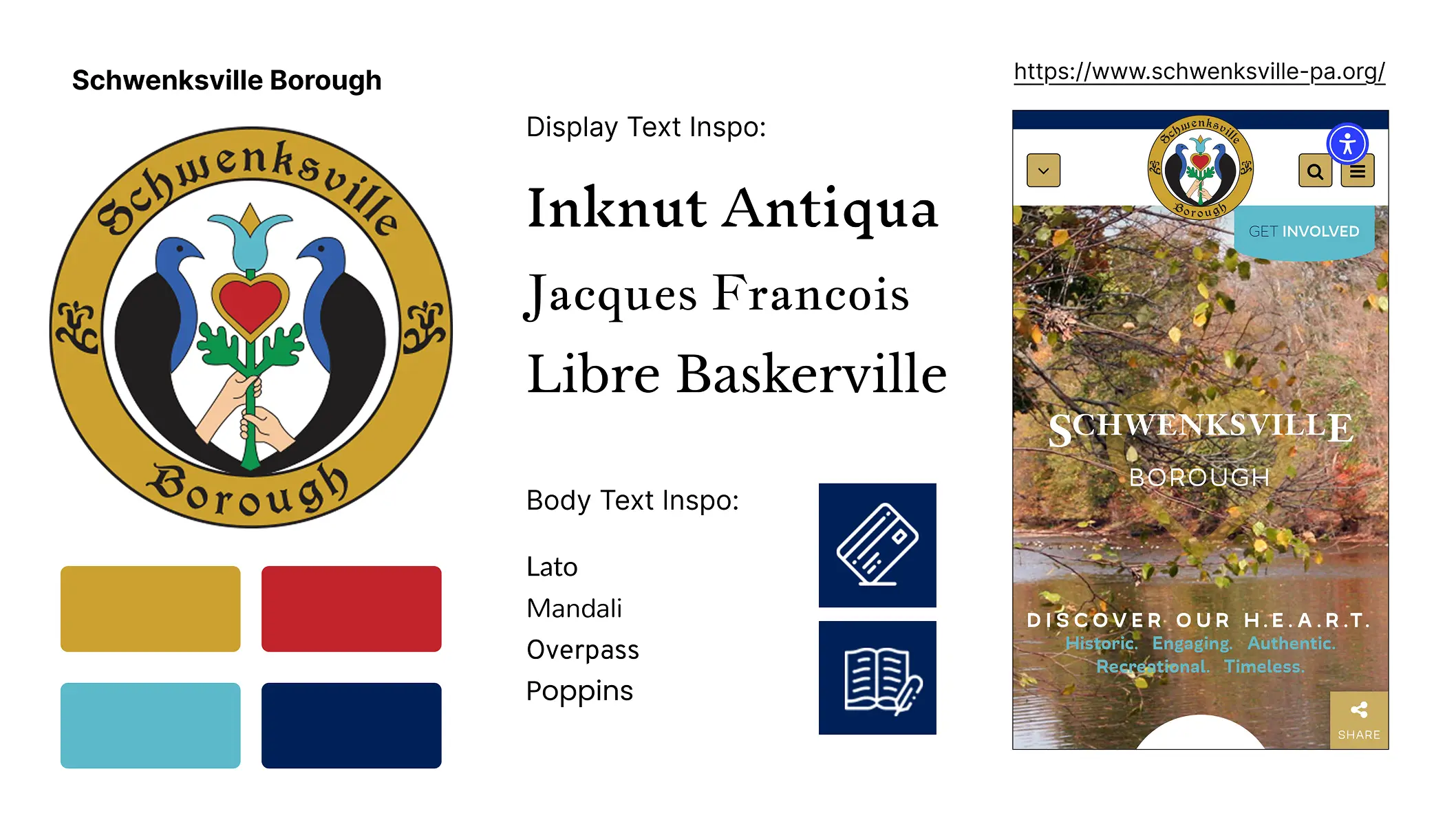
Schwenksville Borough became the primary source of inspiration for the redesign.
I drew inspiration from the borough's vintage-style serif typography, selecting Inknut Antiqua to capture a similar historic yet welcoming feel.
The borough's use of icons influenced the supporting visual elements I later created for the library's identity.
The Love Birds
The borough seal features two birds with a heart between them. I carried these symbols into the new brandmark and later echoed the heart throughout the mobile interface.

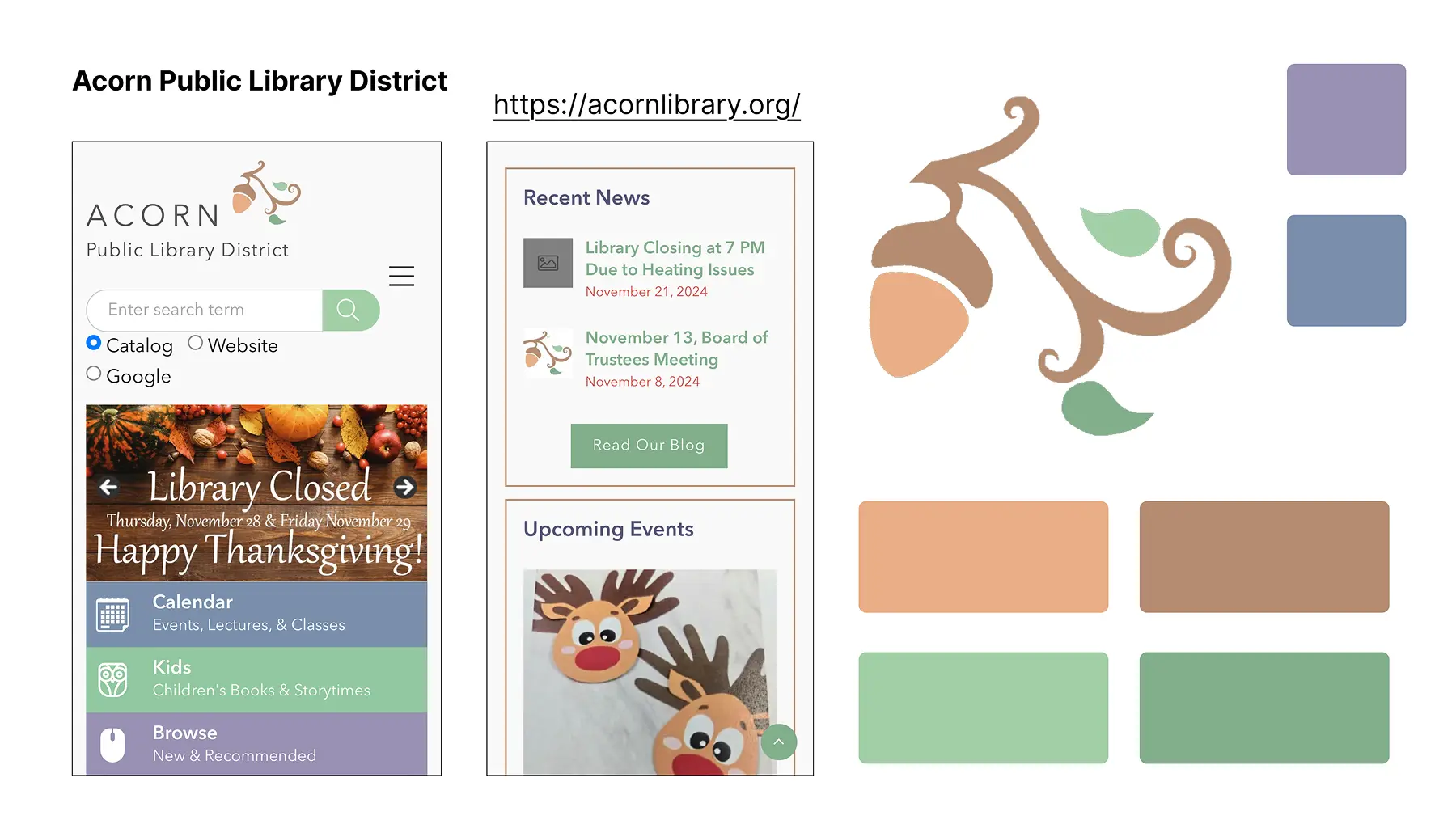
2. Acorn Public Library
3. Thomas Ford Memorial
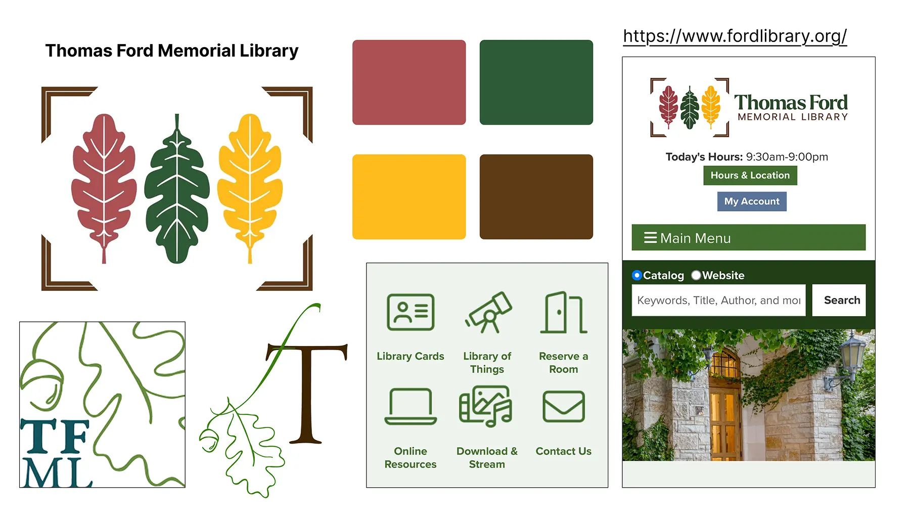
I analyzed two aspirational library brands that captured the same sense of whimsy and charm I wanted to bring to Perkiomen Valley Library. Both identities used supporting icons and colored content strips to create engaging visual systems while highlighting important resources like hours, location, and events.
Redesigning the Brandmark
My idea was to bring together the bird from Schwenksville's seal with a library book to create a "flying book" symbol. I also designed the open book to double as the "V" in Valley.
Through critique, I identified that the thick pages in my first draft weakened the silhouette. I refined the mark by thinning the pages, creating a clearer open-book form while strengthening the connection between the symbol and the library's name.
First Draft

Final Design

Differentiating Within the Library Landscape
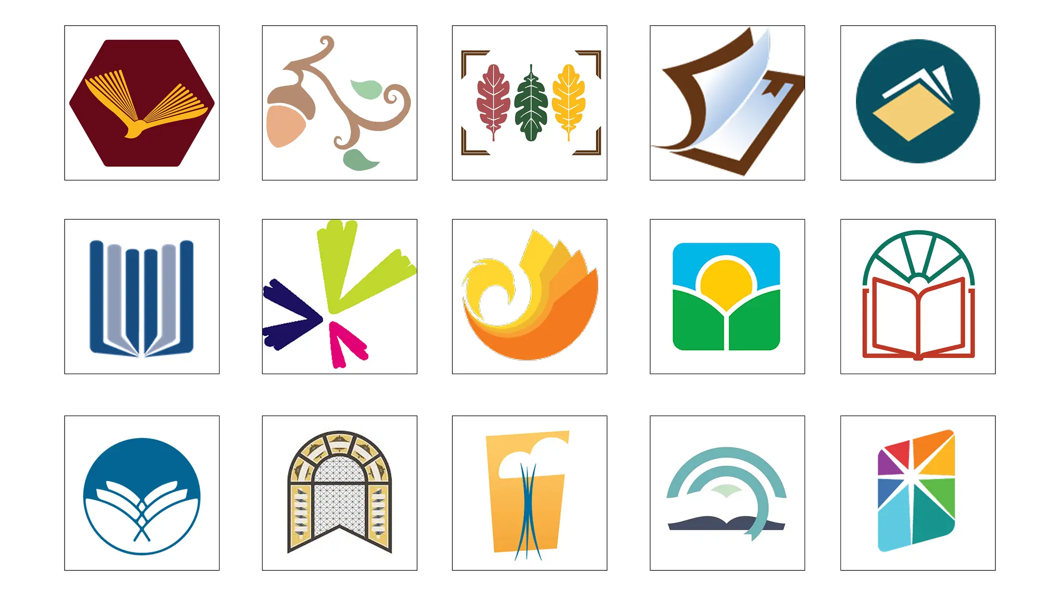
To ensure the new identity felt distinctive while still belonging within the library system, I compared Perkiomen Valley Library's new mark against 14 other library identities.
Building the Visual Style Guide
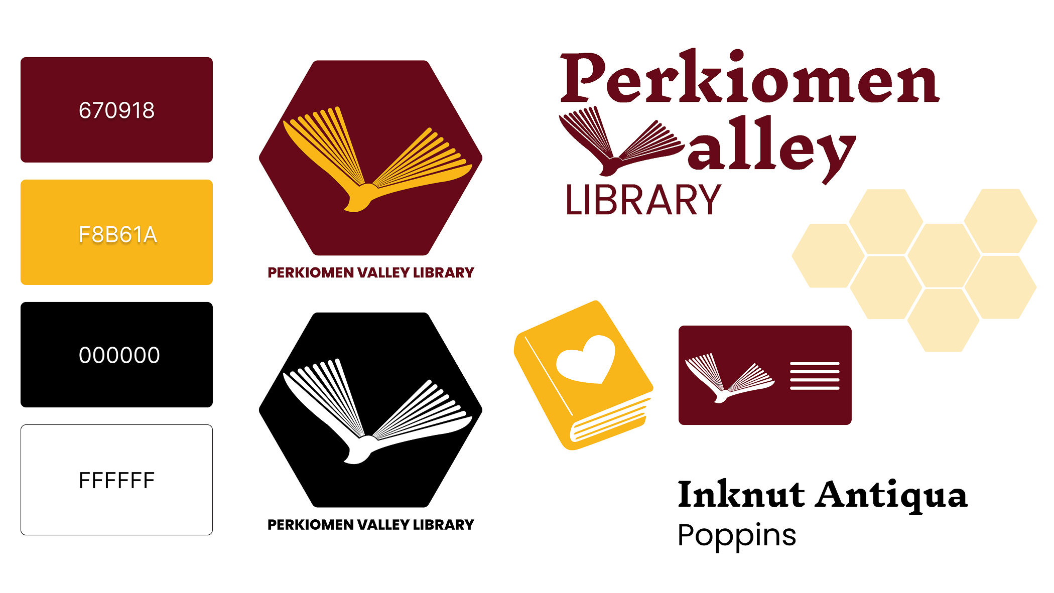
Beyond the brandmark, I created a complete system of assets that could be applied across touchpoints. The style guide established the core elements of the identity, including logo variations, typography, color, patterns, and supporting icons.
A unique element of the wordmark is the integration of the "V" mark into Perkiomen Valley Library's name, reinforcing the connection between the symbol and the library. I also illustrated all supporting visual elements, including the honeycomb pattern and custom library card and donation book icons to for visual cohesion across future applications.
Mobile Interface
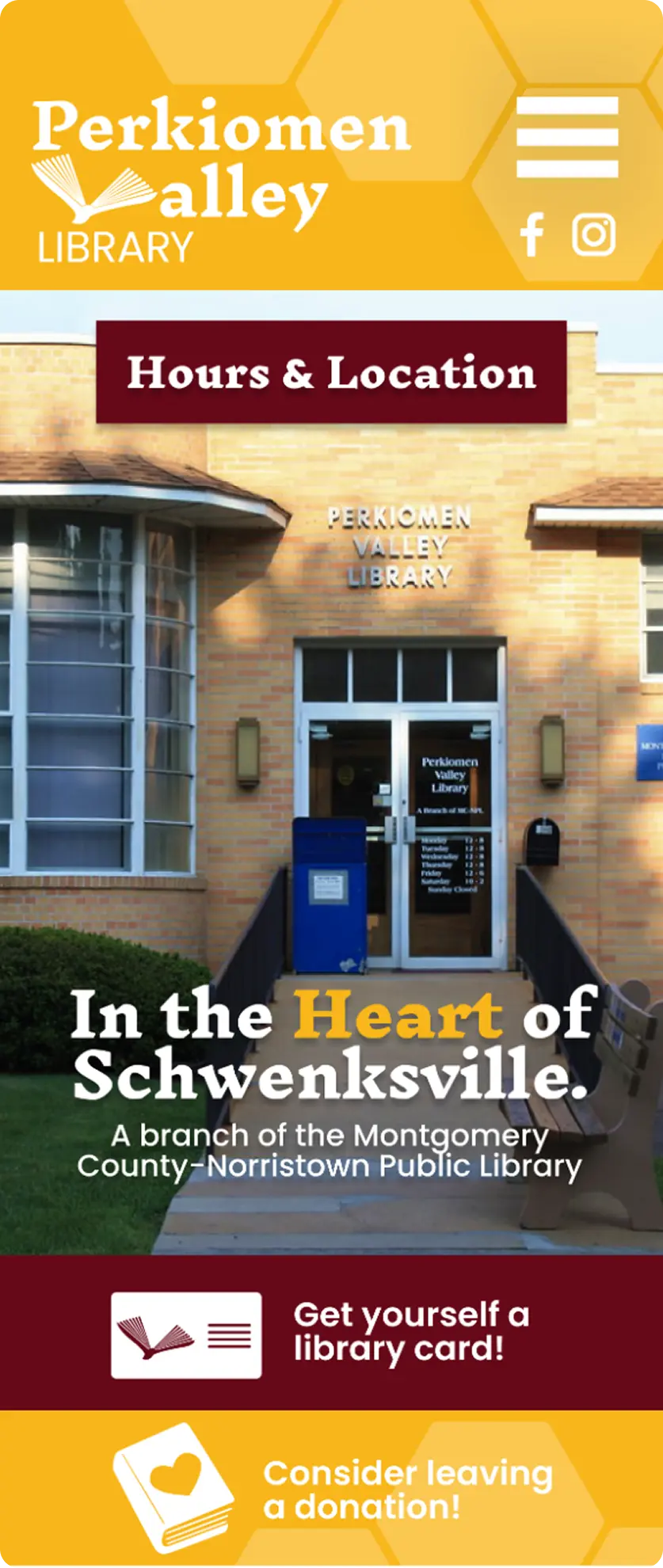
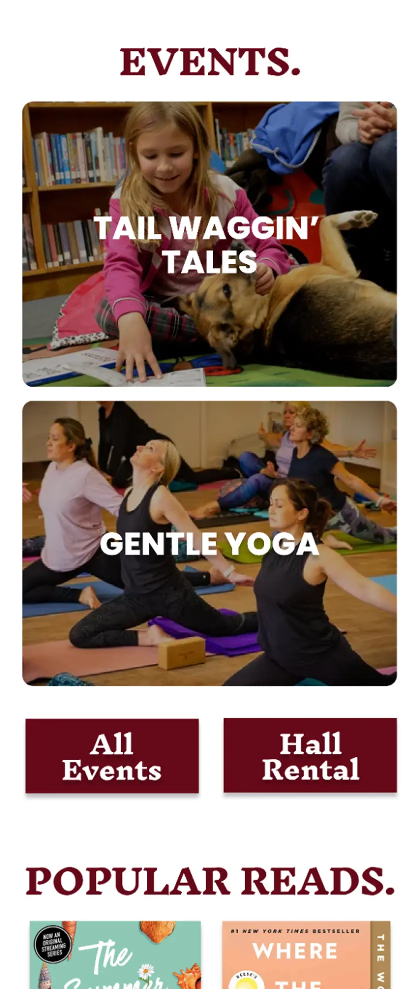
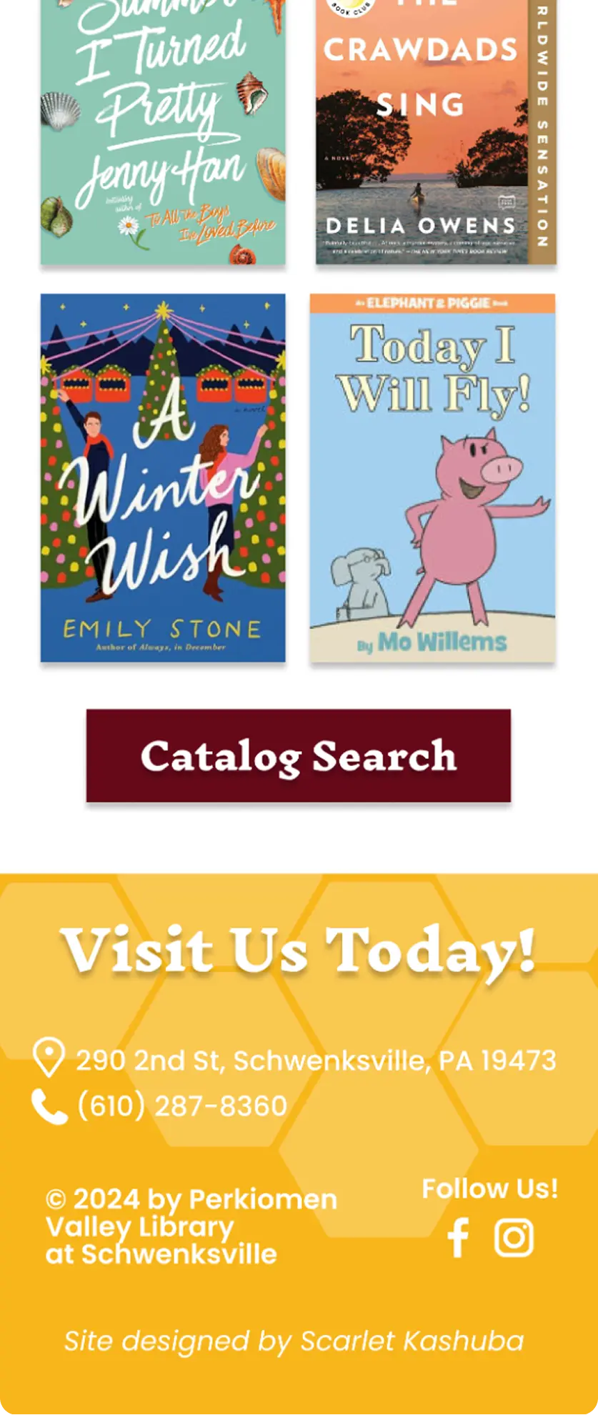
The visual system was designed alongside thoughtful UX decisions. Based on research of other library websites, I prioritized hours, location, and events near the top of the experience through a clear "Hours & Location" CTA and a prominent hero section connecting the library to the "Heart of Schwenksville," a nod to the heart symbol in the borough seal.
I extended the brand system through colored action strips and custom icons for library cards and donations, encouraging visitors to engage with the library beyond borrowing books. Rather than prioritizing only catalog access, the experience highlights community events as a central part of the library's role as a gathering place, with pathways to explore events or reserve the hall. The footer reintroduces the honeycomb pattern to reinforce consistency throughout the experience.
Extending the Identity
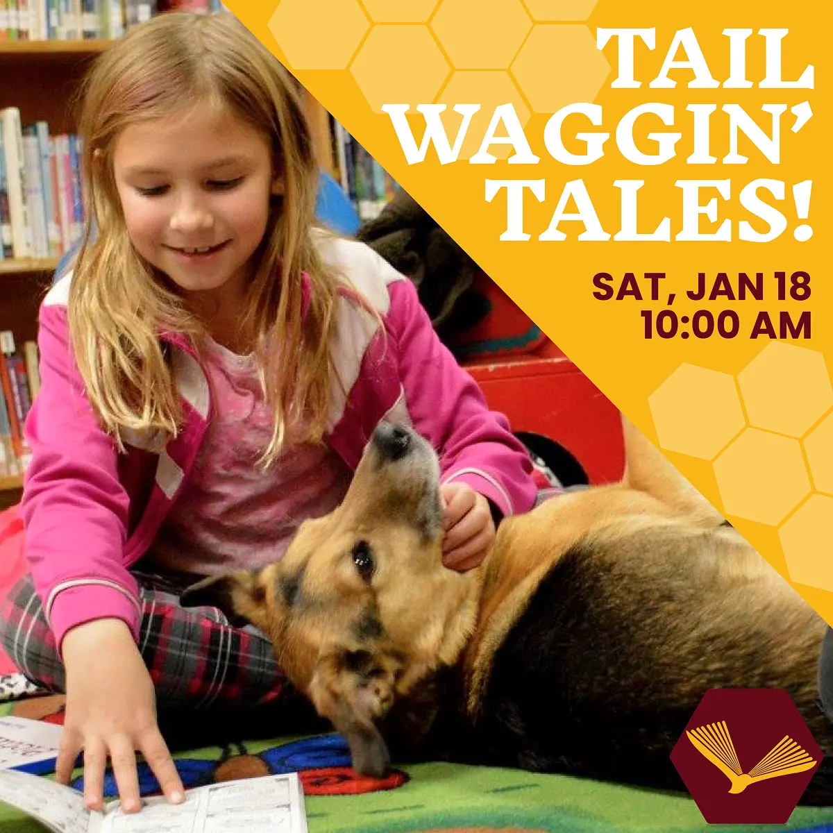
Instagram Post
A reusable event template creates a cohesive social media presence through consistent branding.
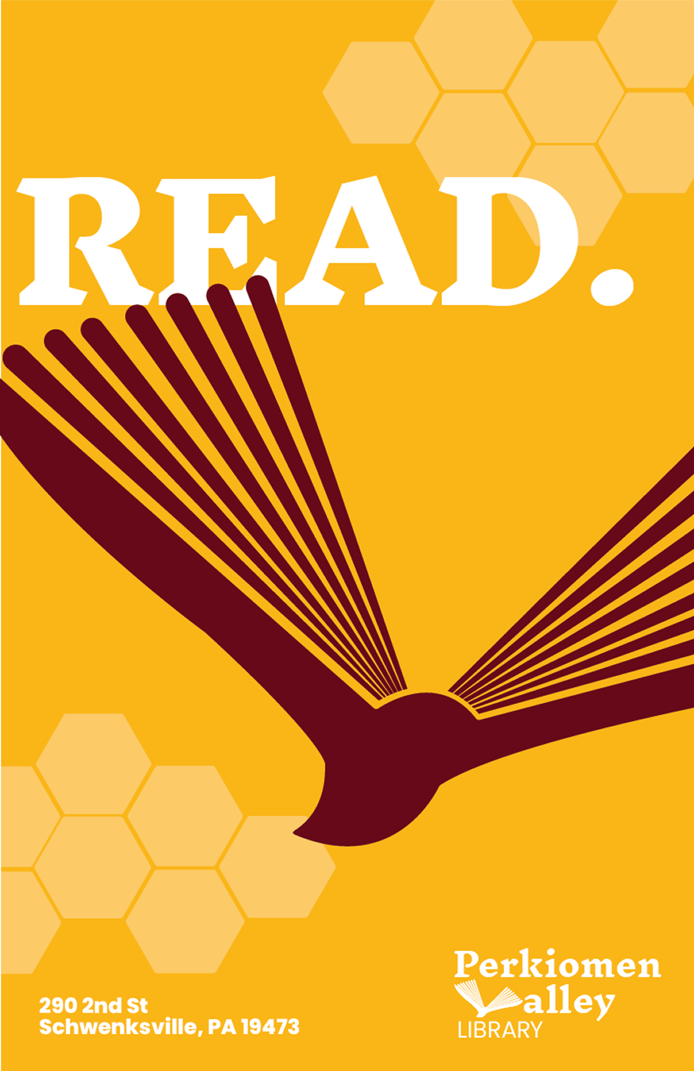
Poster
A promotional poster extends the identity from digital to physical spaces.
App Icon
A concept app icon adapts the brandmark for mobile.


Reflection
This project reinforced that a successful brand is more than a logo; it's a cohesive system applied across every touchpoint. Designing within an established library network challenged me to balance uniformity with individuality, creating an identity rooted in Schwenksville while fitting naturally within a larger visual system. Completing the project in a three-week sprint strengthened my ability to iterate quickly and respond to critique.